
Luxury skincare branding, packaging & website design for Selene
Selene CASE STUDY
We partnered with Selene, a modern skincare brand focused on natural ingredients and elevated rituals, to create a complete brand world from the ground up, including naming, identity, packaging, art direction, and website design.
The goal was to build a skincare brand that felt luxurious yet grounded in familiar, natural ingredients, balancing scientific credibility with a celestial, sensorial aesthetic.
From product naming through packaging and digital experience, every touchpoint was designed to communicate refinement, clarity, and quiet confidence.
BRANDING
NAMING
Website
Packaging
ARt direction
Illustration


Brand Strategy & Naming
We developed the name Selene, inspired by the Greek moon goddess, to evoke ritual, luminosity, and transformation.
This celestial reference provided a rich conceptual foundation for the brand, influencing everything from the logo design to packaging finishes and visual storytelling.
The identity was built around the idea of skincare as a quiet, nightly ritual, grounding the brand in both nature and atmosphere.

The Challenge
Selene entered a highly competitive skincare market dominated by both clinical minimalism and cliché marijuana branding.
The new brand needed to:
Signal luxury and quality at first glance
Differentiate through concept and storytelling
Feel contemporary, elevated, and gift-able
Build trust with a discerning audience
The visual system needed to feel premium without becoming sterile, and expressive without losing restraint.
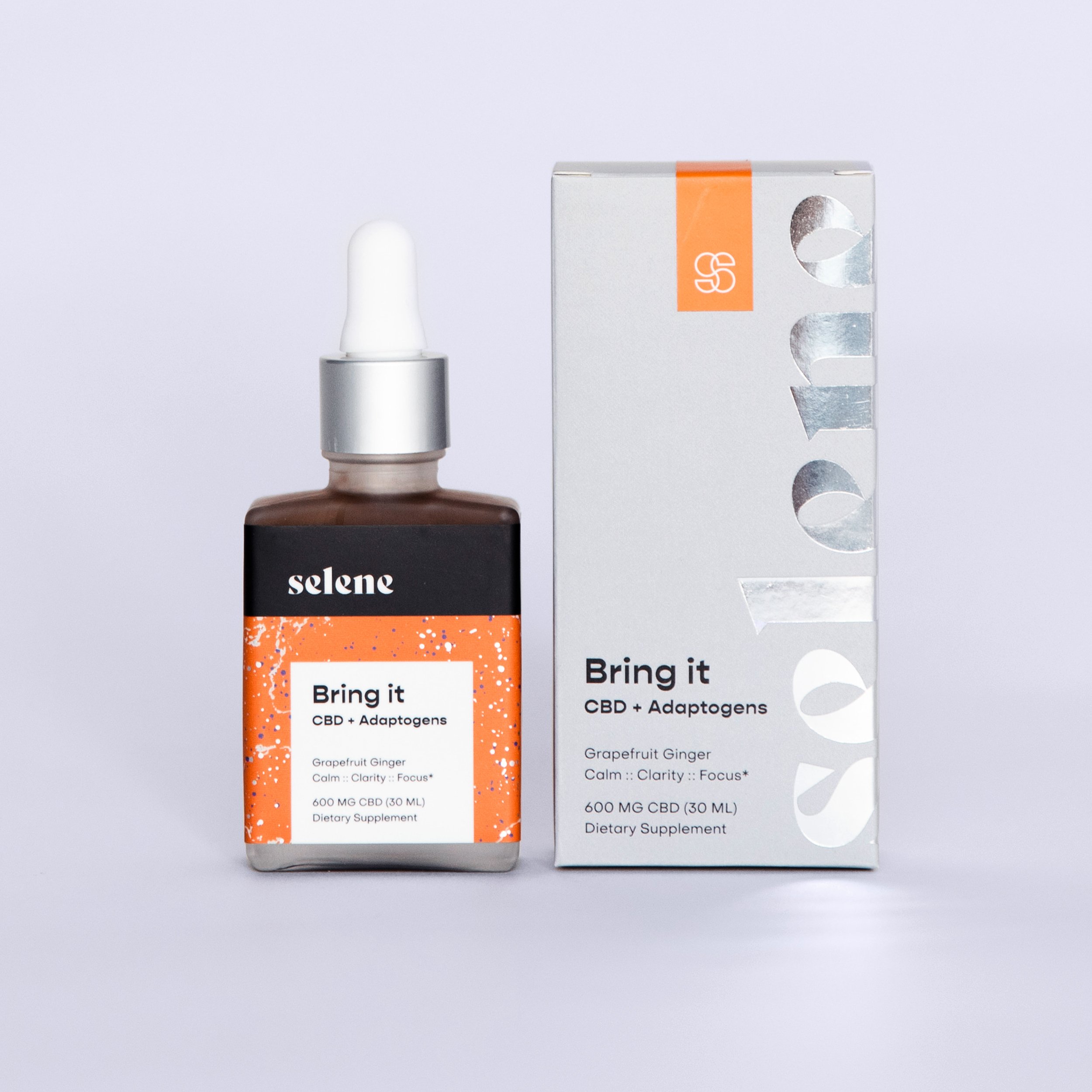
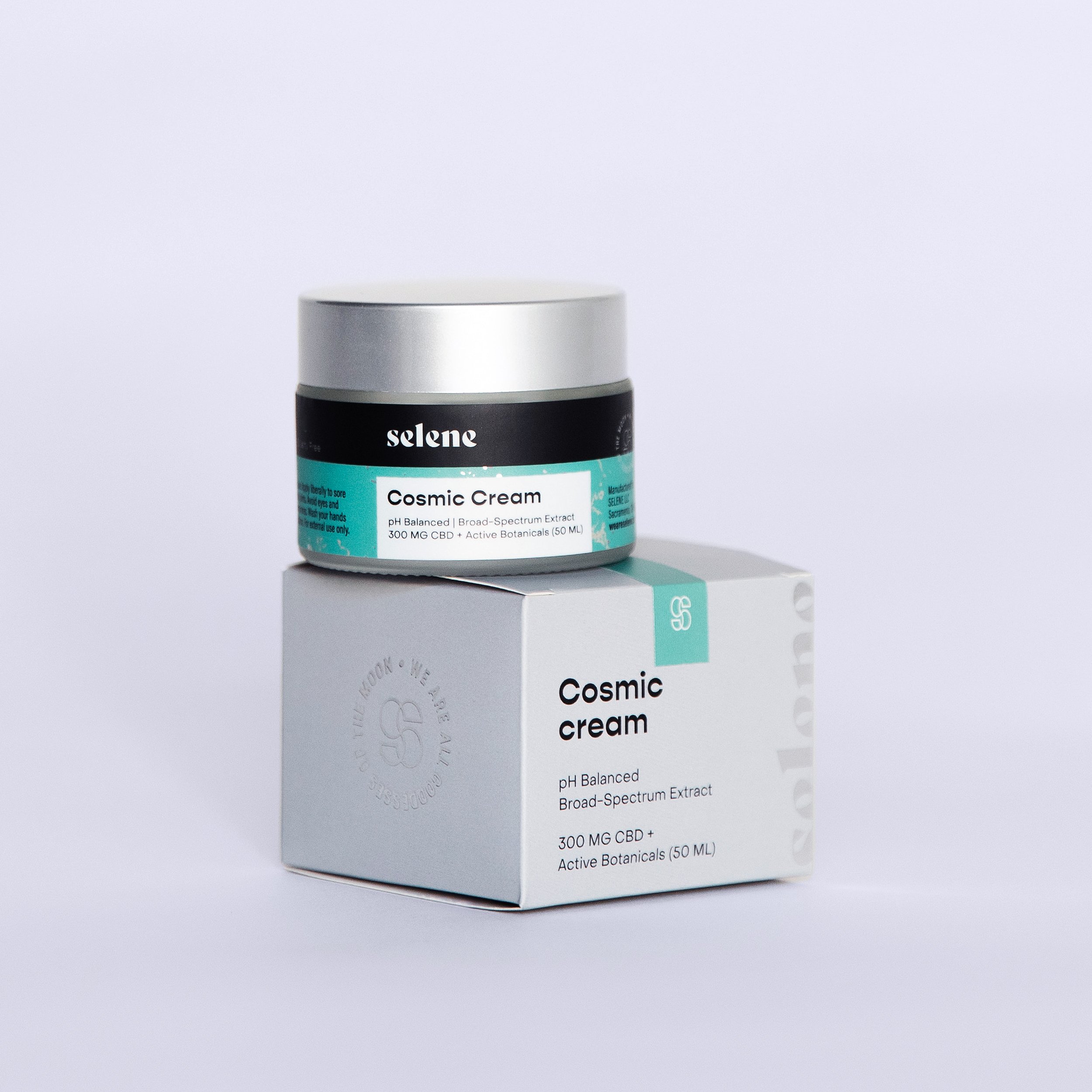
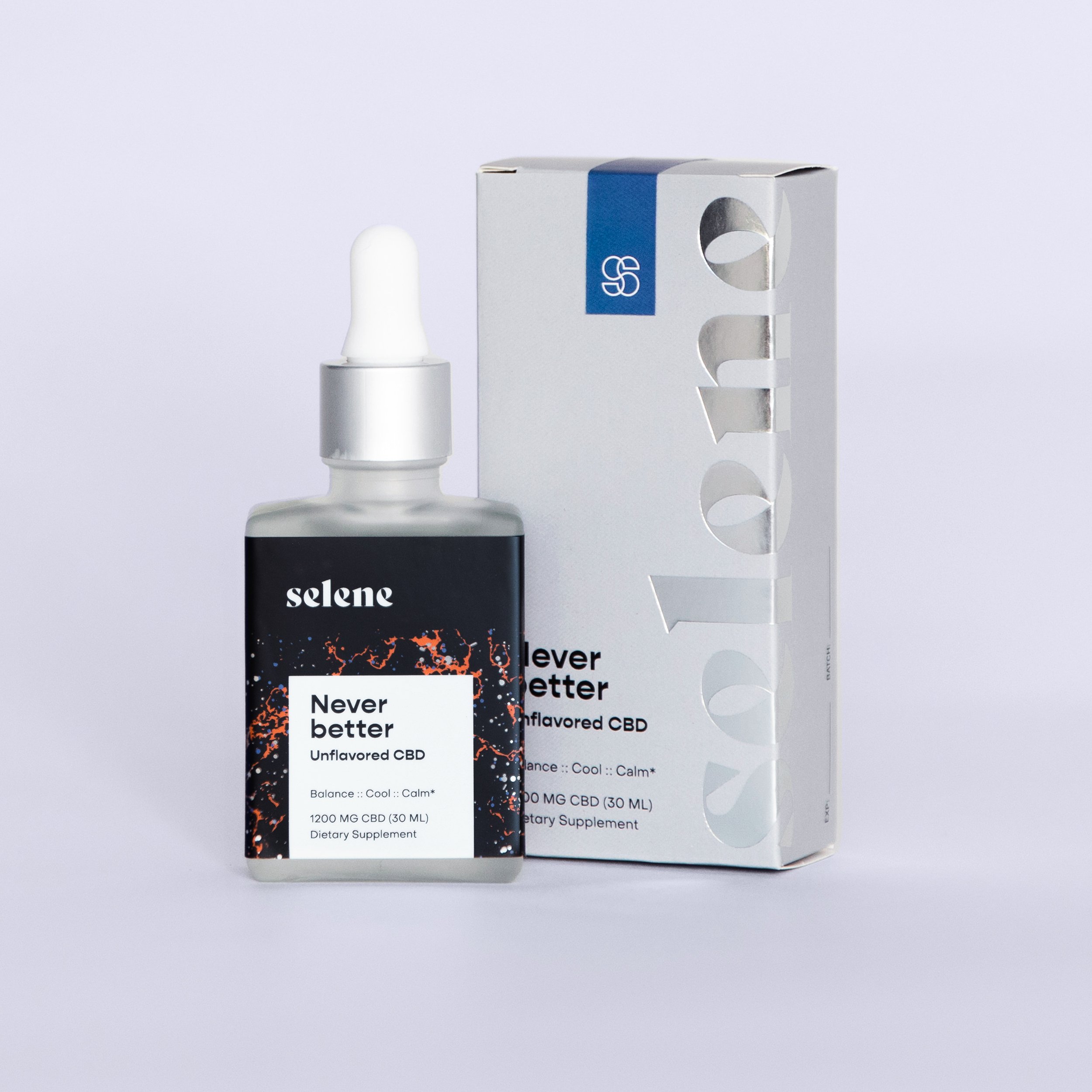


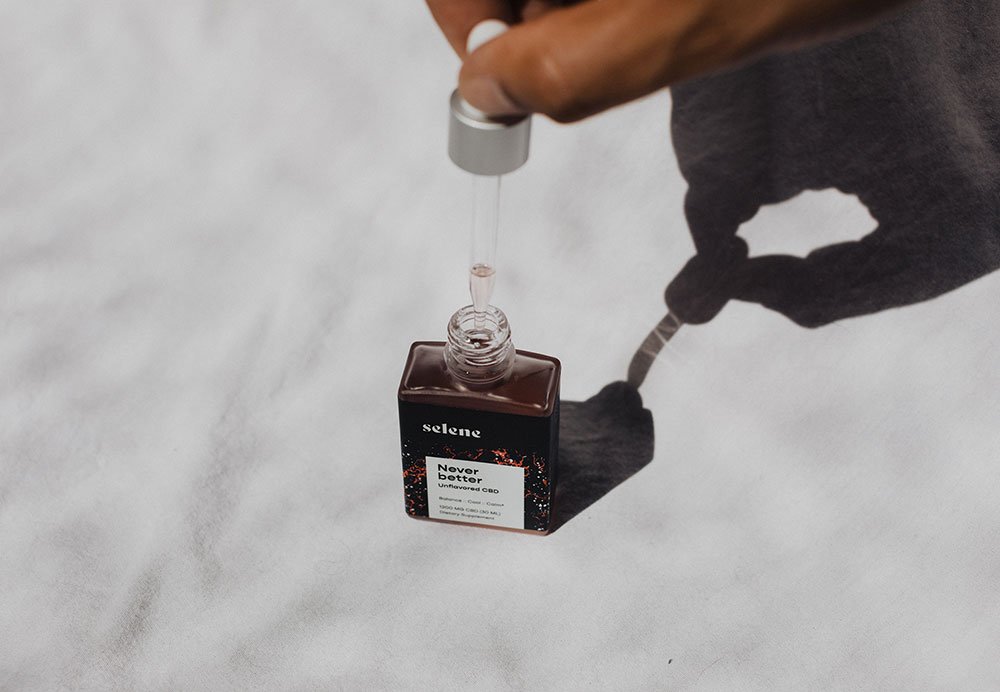
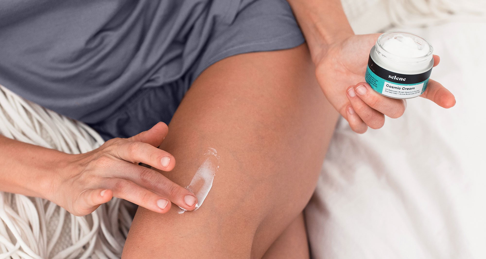
Packaging Design: Luxury Through Restraint
Frosted glass bottles
High-end frosted glass bottles were selected to signal quality and permanence. The matte finish creates a soft, diffused glow, reinforcing the brand’s lunar inspiration and premium positioning.
Celestial label system
Product labels feature silver foil speckling designed to abstractly reference stars in the night sky. These subtle metallic details add dimensionality and tactility without overwhelming the minimal design.
Outer packaging
Neutral gray boxes with silver spot varnish were chosen to create a refined, gallery-like presentation. Ample white space and restrained typography allow the product name and materials to take center stage, reinforcing the luxury positioning.
Website Design
We designed the website to mirror the product experience: calm, minimal, and quietly luxurious.
The site balances e-commerce functionality with editorial storytelling, incorporating:
Product education
Ingredient highlights
Atmospheric photography
Clear purchasing pathways
The result is a digital experience that supports both discovery and conversion while reinforcing the brand’s premium positioning.

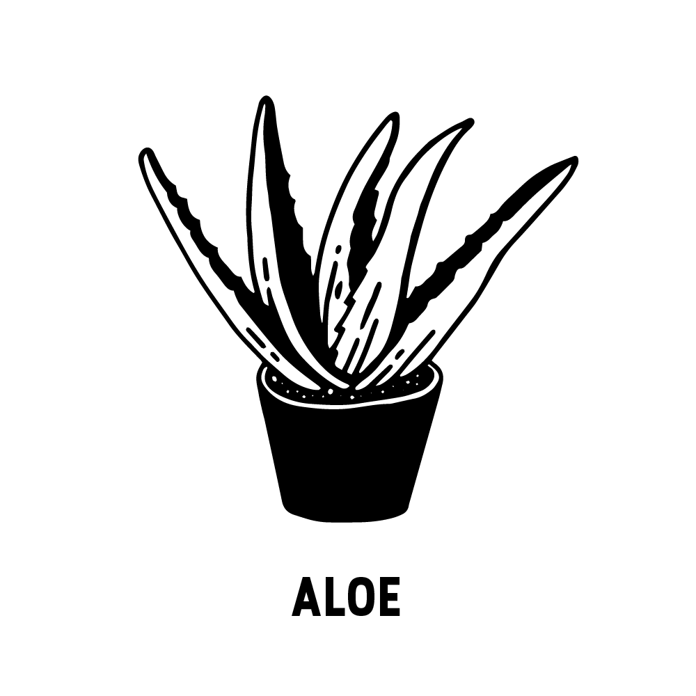
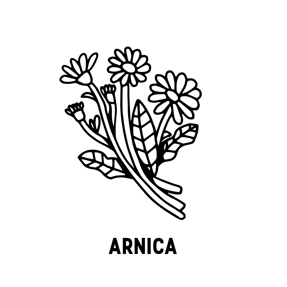
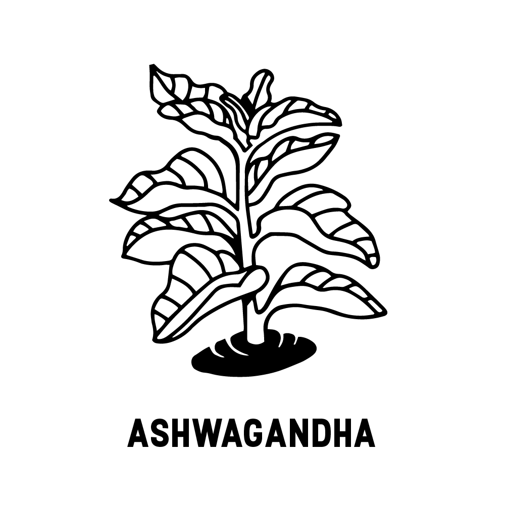
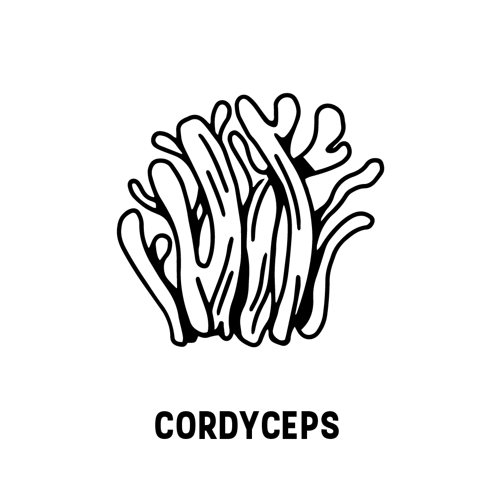
Ingredient Illustration Library
To build trust and transparency, we developed a custom illustration library showcasing the ingredients used across the product line.
Each ingredient was illustrated and paired with concise descriptions explaining its purpose and benefits. The goal was to reinforce familiarity while highlighting that these formulations use natural ingredients customers already recognize and trust.
This system was used across the website, packaging inserts, and marketing materials to support education and discovery.
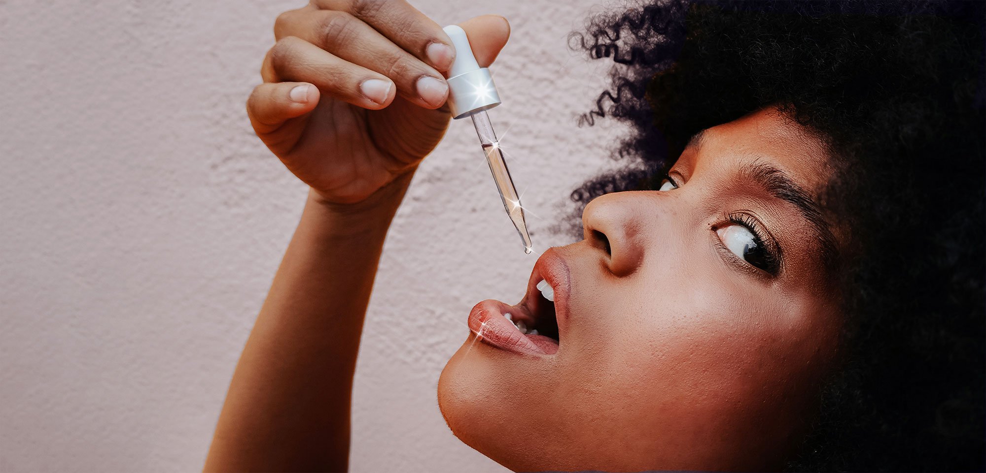
Art Direction & Photography
We art-directed product photography to ensure consistency across ecommerce and marketing channels.
The photography emphasizes:
Soft lighting and atmospheric shadows
Material textures and glass finishes
Minimal, spacious compositions
A sense of calm
These images were used throughout the website and marketing ecosystem to maintain a cohesive brand presence.


Supporting Brand & Marketing Materials
Printed & retail materials
Product sell sheets
Takeaway cards describing formulations
Educational ingredient materials
Packaging & shipping experience
Sample vial packaging
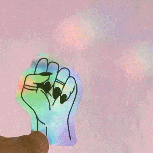
Iridescent illustrated stickers for shipments
Branded inserts and collateral
These elements extend the brand experience beyond the product itself, creating moments of delight and reinforcing quality at every touchpoint.
Outcome
The Selene brand launched with a fully realized identity system spanning naming, packaging, digital experience, and marketing.
The cohesive brand world supports:
Premium positioning in a crowded skincare market
Strong shelf and e-commerce presence
Clear ingredient storytelling
A memorable unboxing experience
Scalable assets for ongoing growth
By combining restraint, material quality, and thoughtful storytelling, the brand establishes a distinct and elevated presence from first impression through daily use.
Building a skincare or wellness brand?
We create brand worlds for modern beauty, wellness, and lifestyle products, from naming and identity through packaging, e-commerce, and campaign imagery.
If you’re launching or evolving a premium product line:
