SPECIALTY COFFEE / BRAND EVOLUTION
A brand evolution for Old Soul Co. Sacramento's beloved coffee roaster.
Old Soul Co. is a Sacramento institution. They are a specialty coffee roaster with deep community roots, a loyal following, and a brand voice that's warm, witty, and entirely their own. They'd built something real. They needed a visual system that could keep up with it.
We refined the core mark, built an extensive typographic system, and designed everything from coffee packaging and premium tin canisters to merchandise, environmental graphics, and a custom mural for their Fair Oaks location.
Visual Identity / Logo Refinement / Typographic System / Packaging Design / Environmental Graphics / Merchandise / Illustration / In-Store Materials / Copywriting

Logo Refinement & Identity Evolution
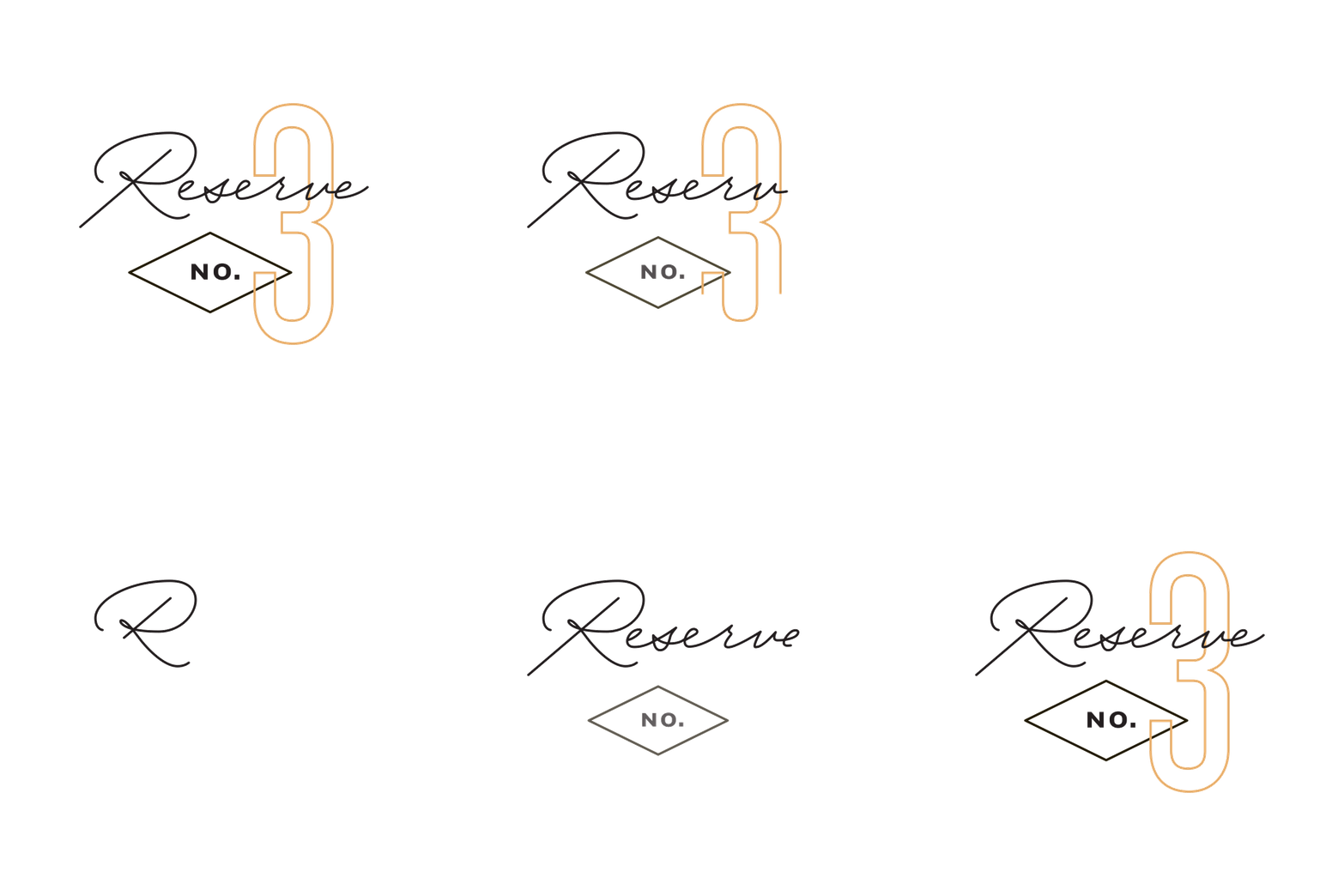
This redesigned logo is a refined and simplified version of the original mark. The updated identity maintains the spirit of the existing brand while improving clarity, balance, and versatility across applications.
The refreshed logo system performs consistently across packaging, merchandise, signage, and digital uses, ensuring recognizability at any scale.
This evolution allowed the brand to modernize without losing the familiarity that longtime customers value.
The Challenge
Old Soul had built something most brands spend years trying to manufacture: a real community following, a genuine voice, and a personality that couldn't be faked. The brief wasn't to reinvent any of that. It was to give it a visual system worthy of it.
A typographic system
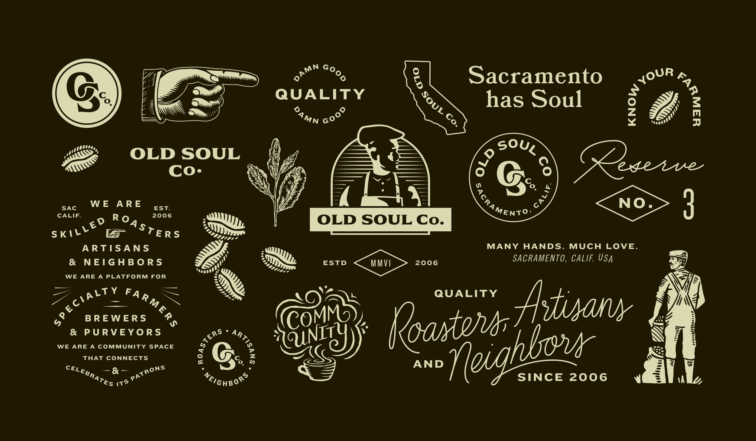
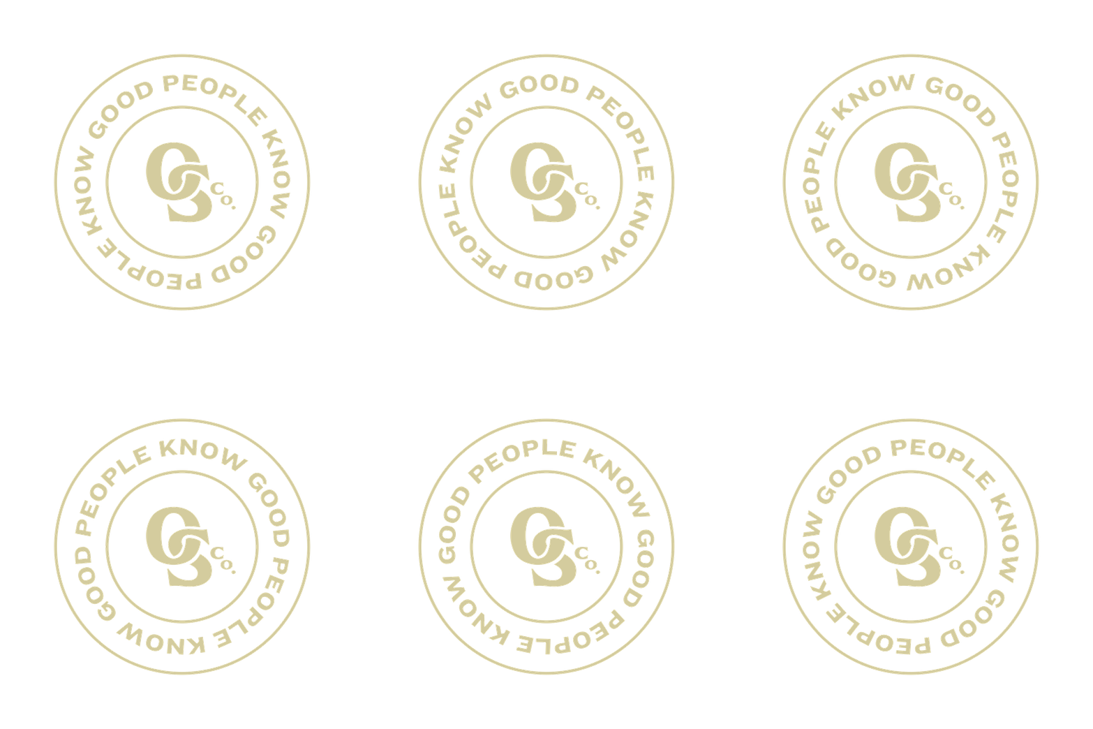
A core component of the identity expansion was the development of an extensive library of typographic lockups and badges.
We created both the visual designs and the copywriting for these pieces, writing taglines and phrases that sound like Old Soul actually said them. Warm, witty, and community-driven. The system is flexible enough to keep introducing new expressions without ever losing coherence.


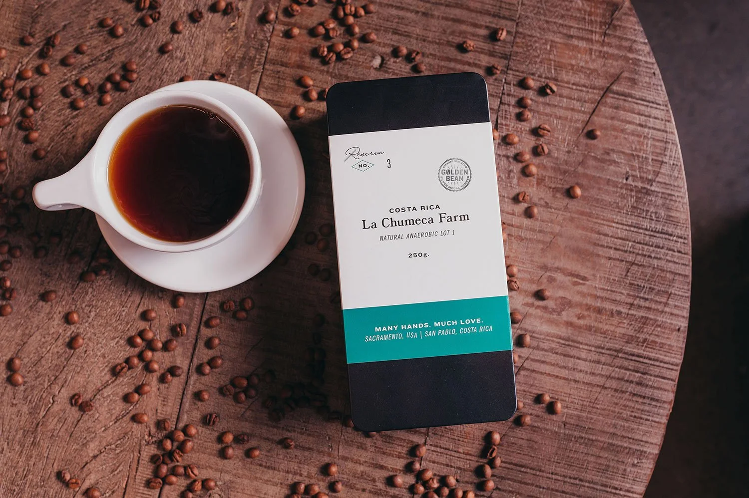
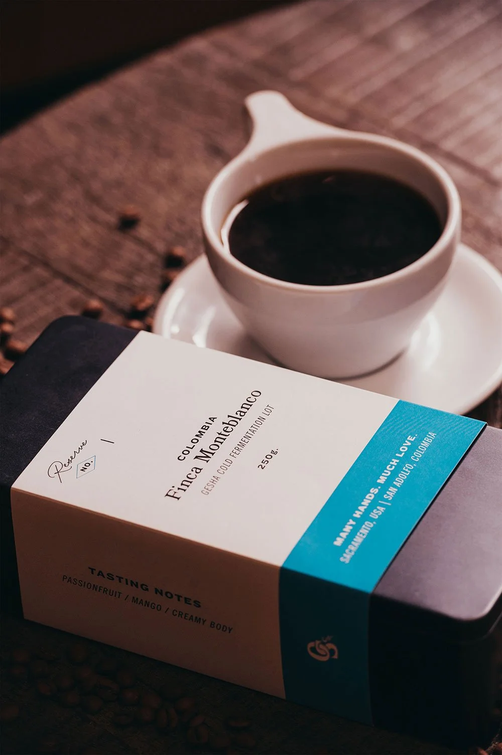
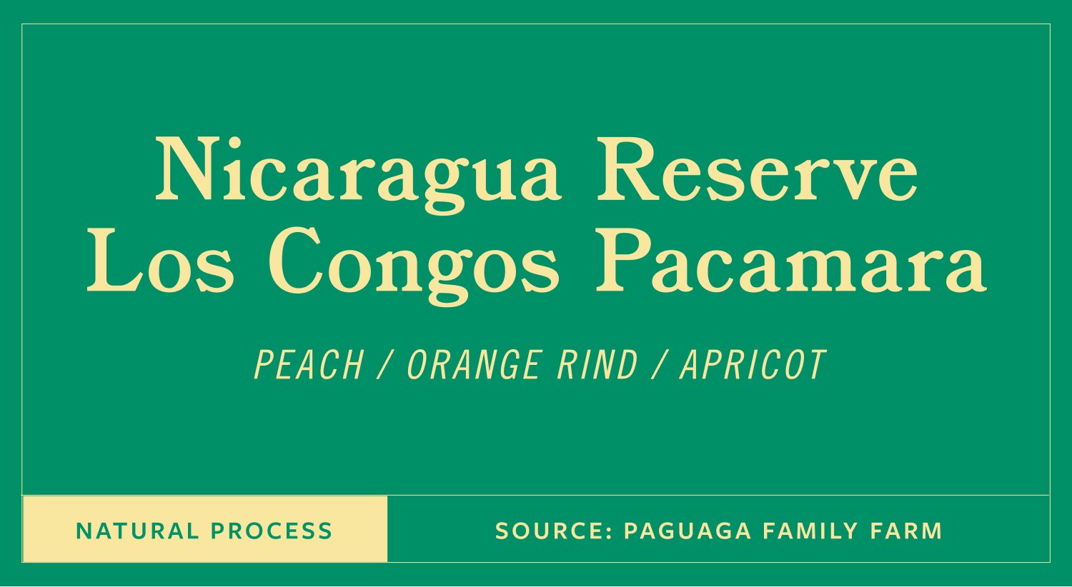
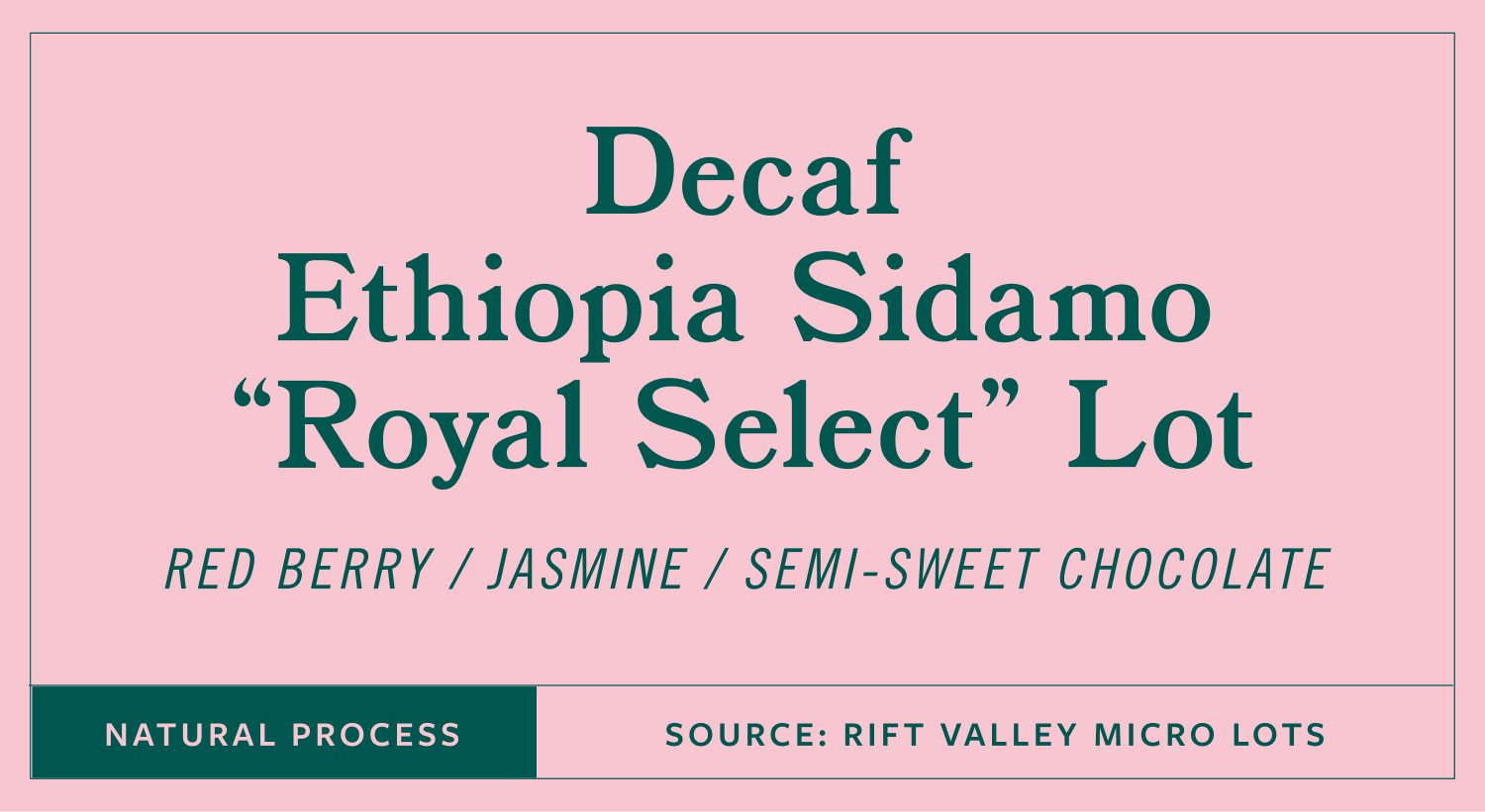
For higher-end offerings, we designed custom tin canisters that elevate the presentation without losing the warmth. Giftable, collectible, and still unmistakably Old Soul.
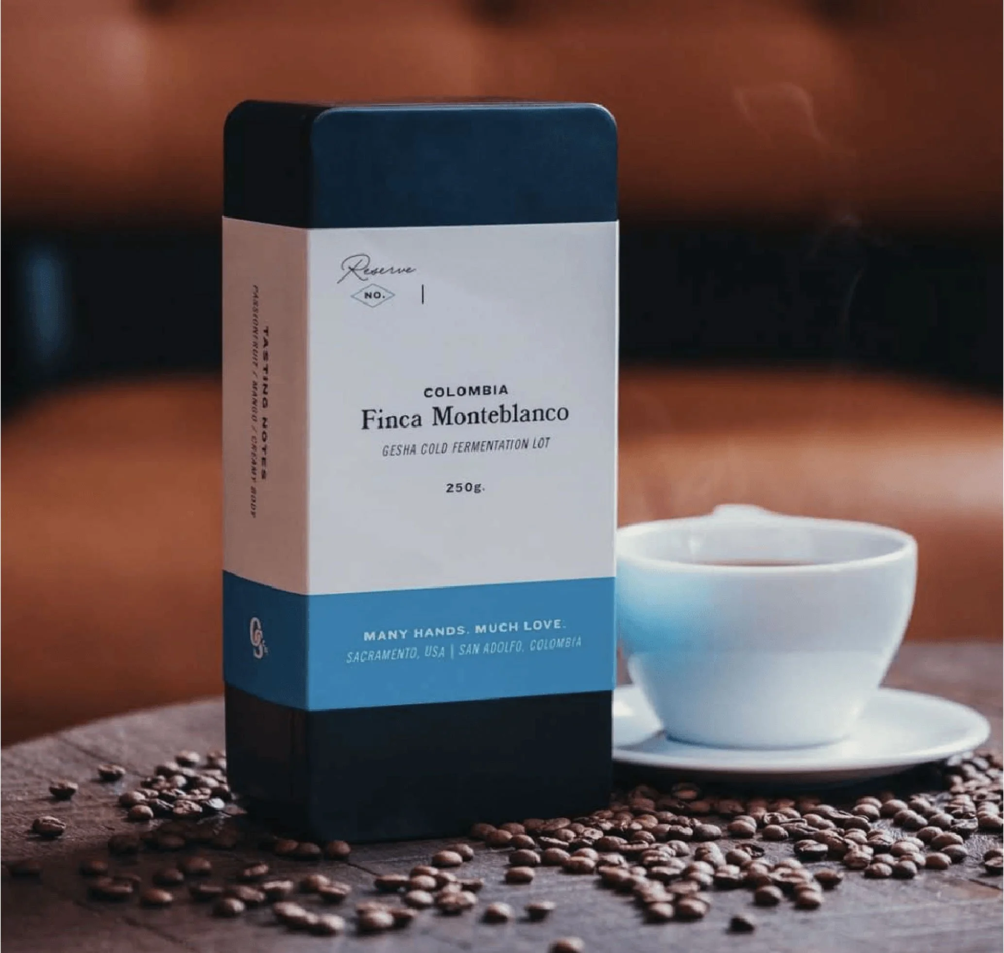
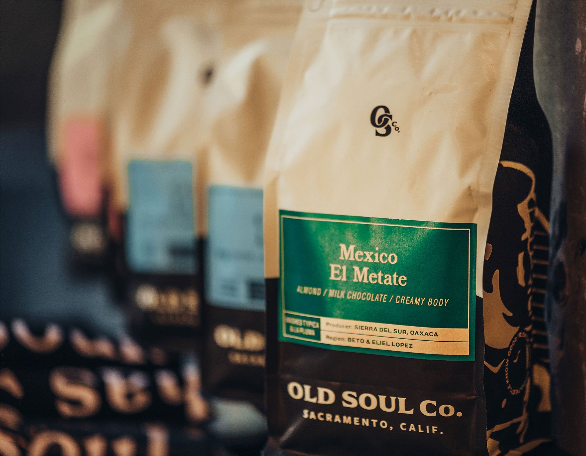
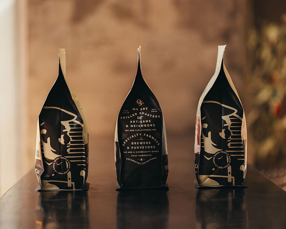
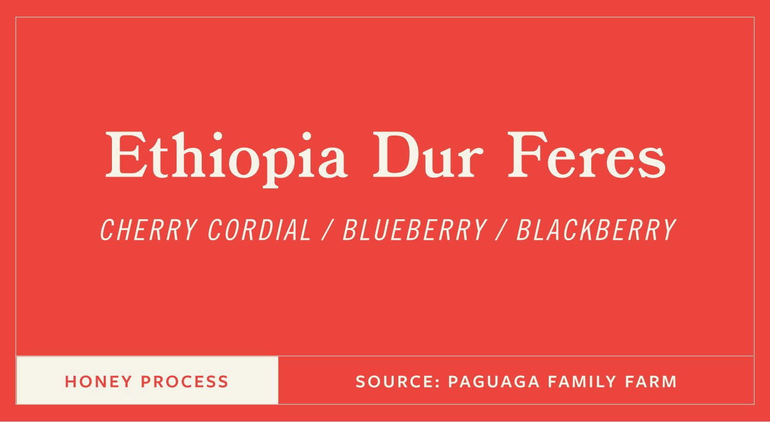
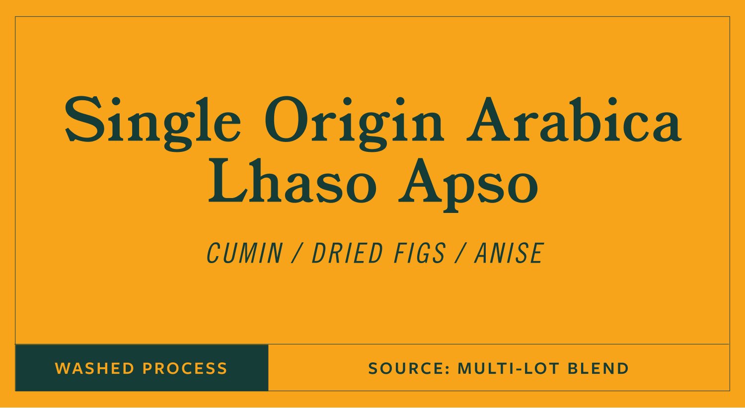
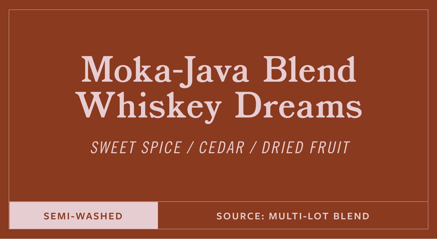
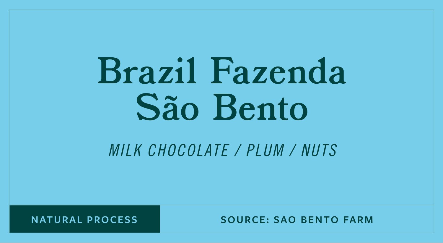
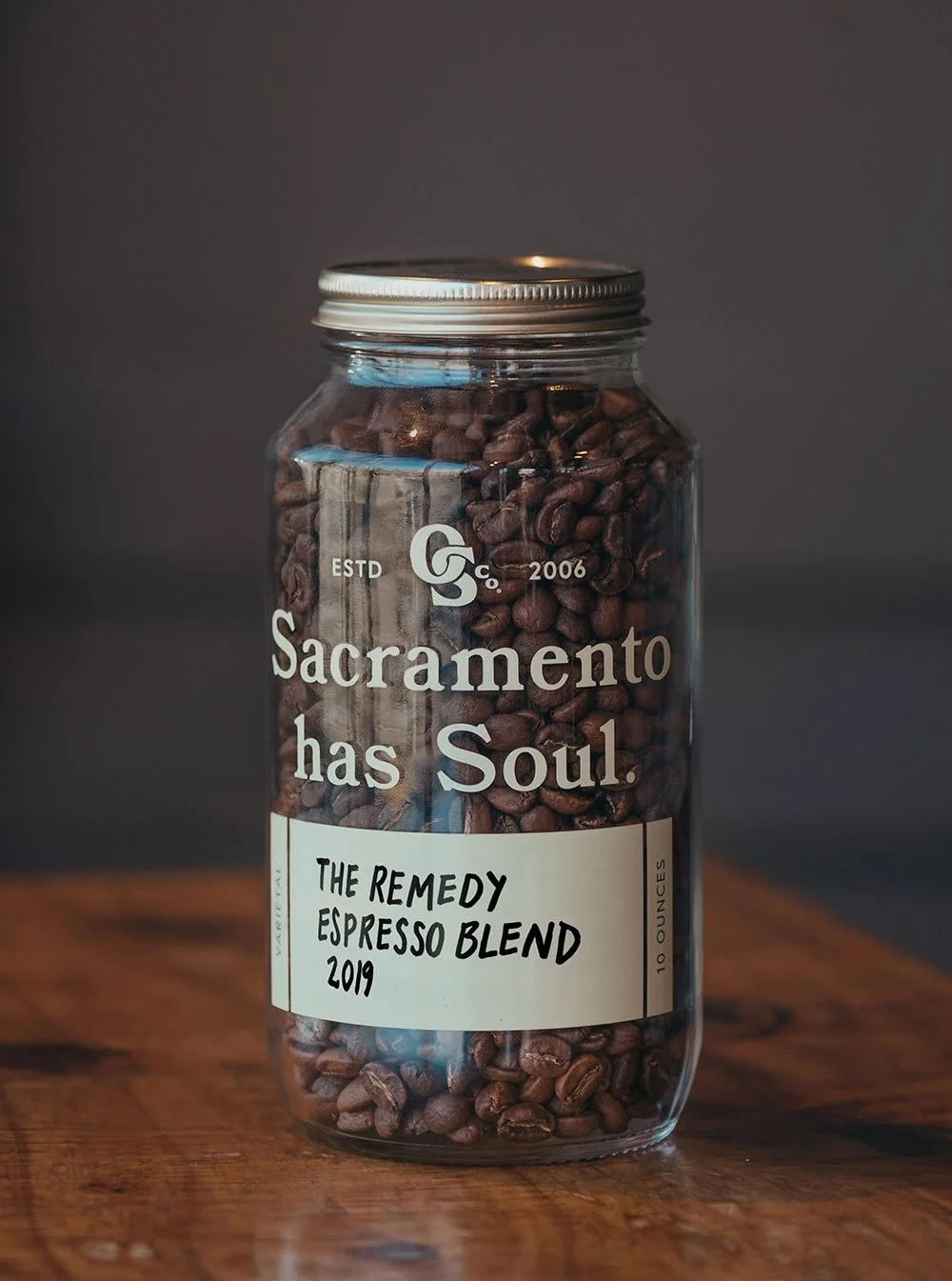
Standard packaging for everyday roasts needed the same care as the premium line. A system that varies across blends and origins while keeping the shelf presence consistent and the brand immediately recognizable.
Custom Merchandise
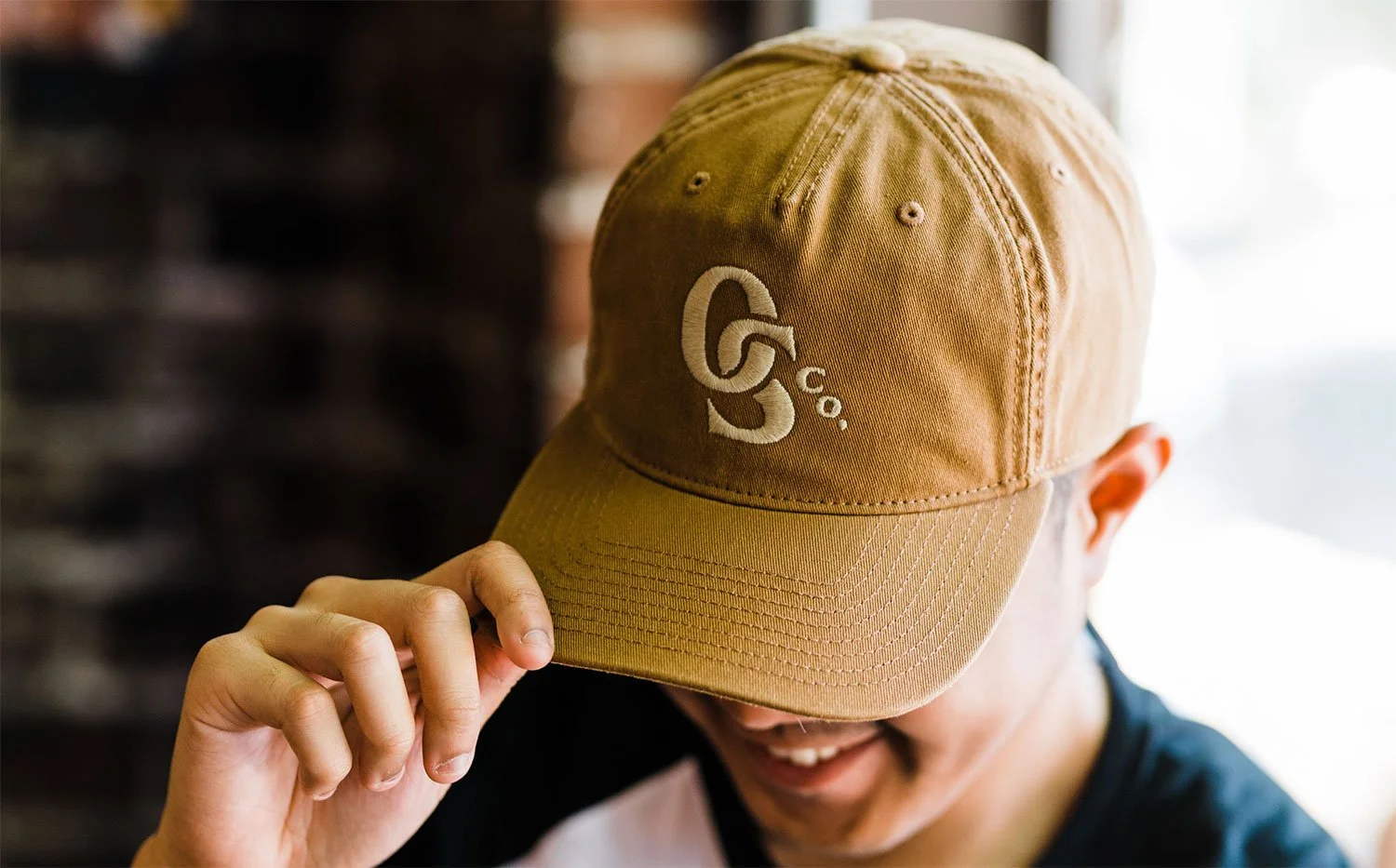
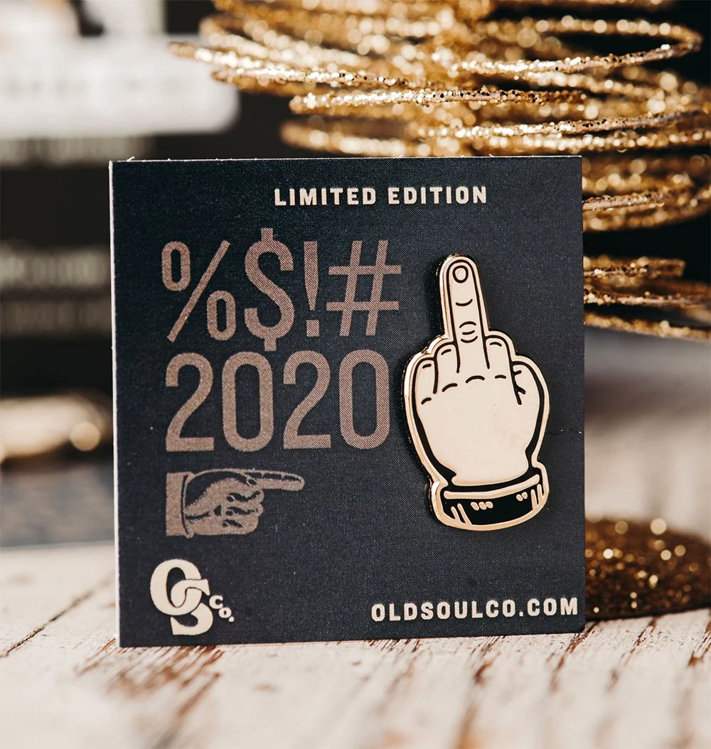
The merchandise program extended the brand beyond the cup. T-shirts, hats, tote bags, mugs, enamel pins, seasonal items. Each piece integrates the typographic system so it feels like something worth keeping rather than something promotional. The middle finger enamel pin from 2020 remains one of our favorites.
Environmental Graphics & Mural Design
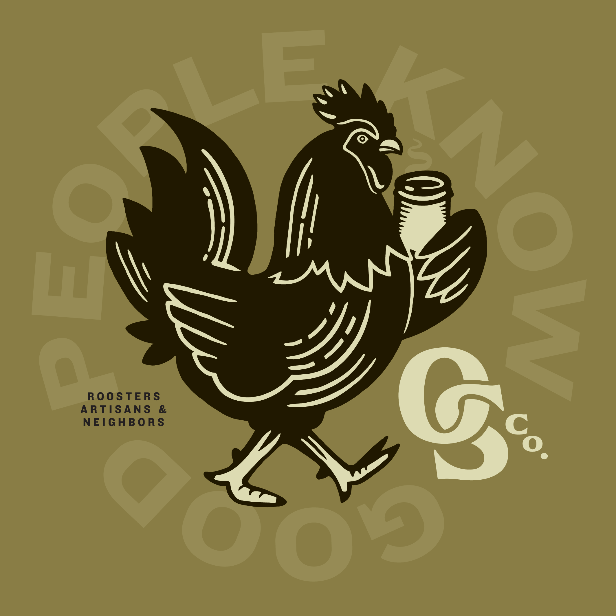
For the Fair Oaks location, we designed a custom illustrated rooster mural to anchor the space and give the café its own identity within the broader brand. The rooster became the mascot for that location, adapted across merchandise and in-store materials specific to Fair Oaks. A strong sense of place, still connected to everything else.
Mural painted by and video courtesy of Stranger Projects

Photography by Lyda Studios
Retail & In-Store Applications
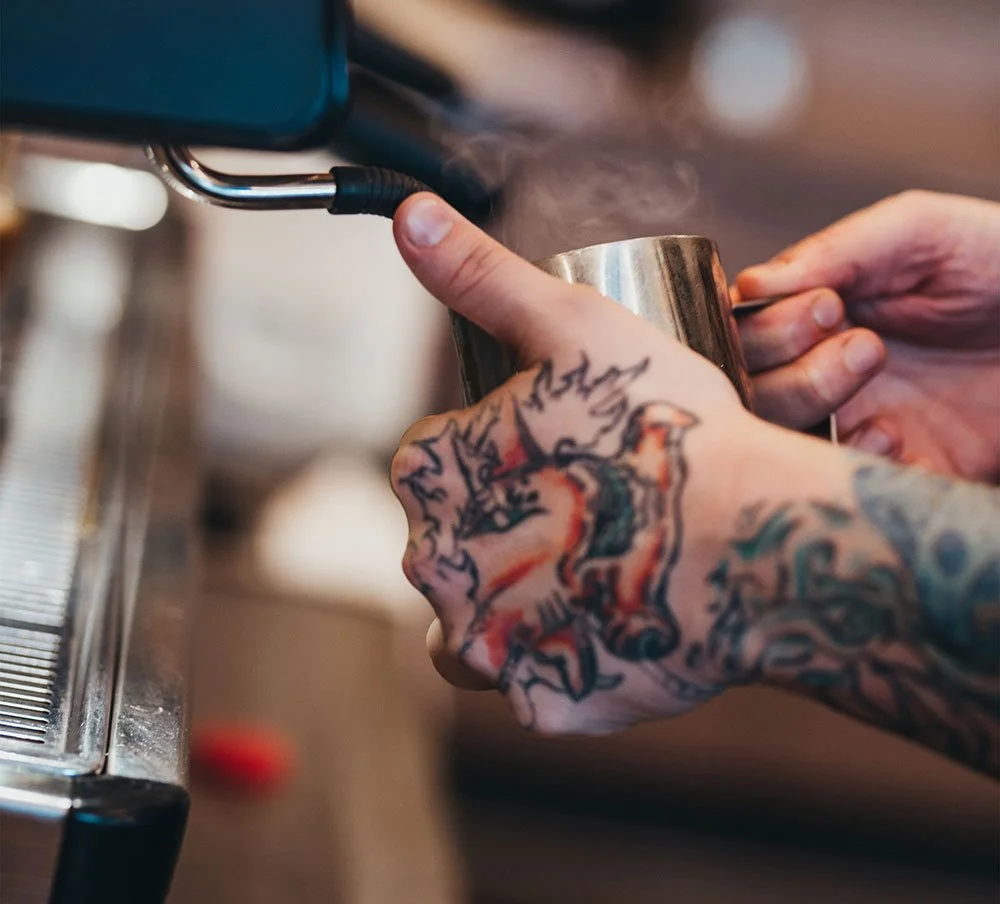
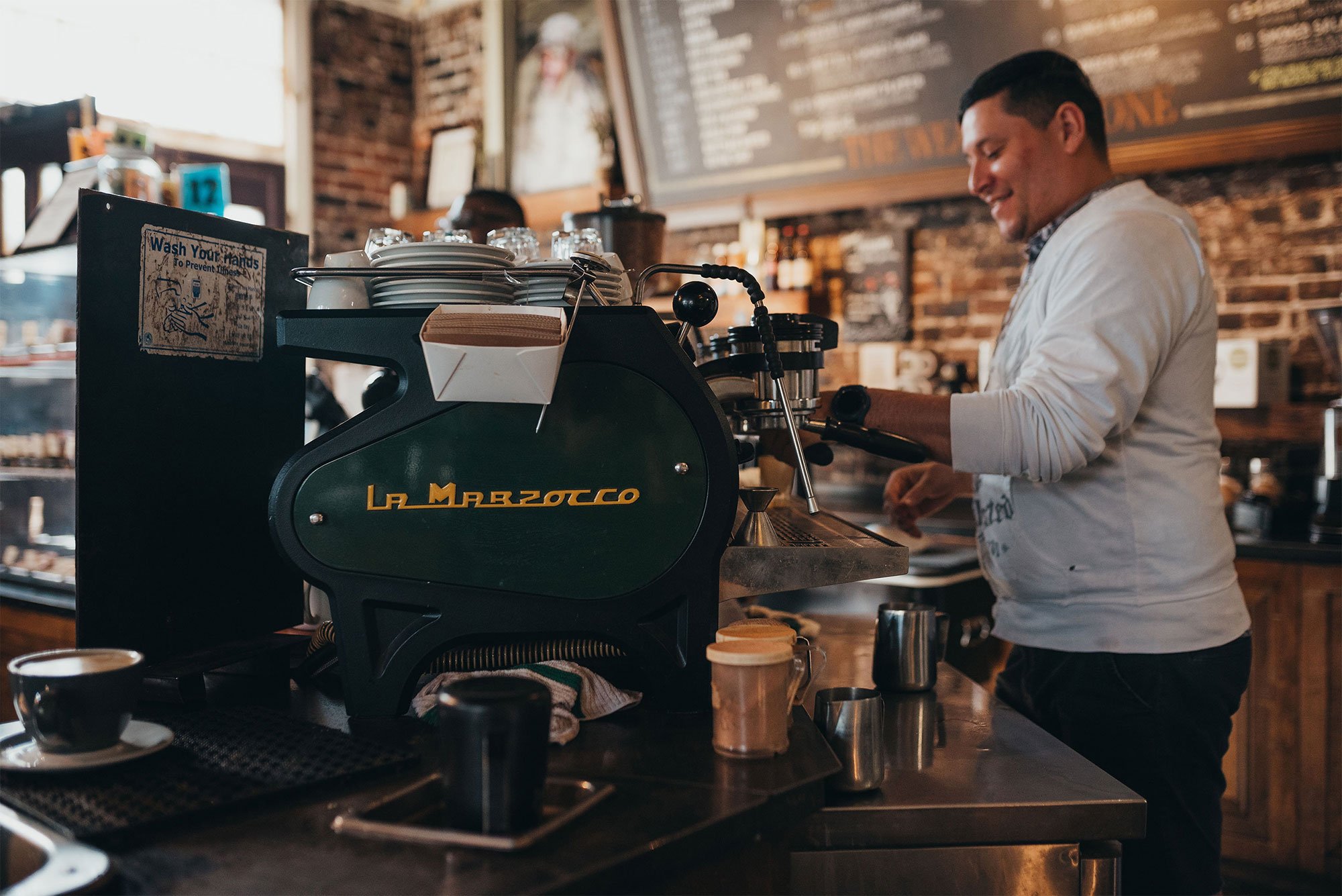
Every touchpoint a customer interacts with in the cafe, from the paper cup in their hand to the menu on the wall, got the same attention as the packaging. To-go cups, bean jars, pastry bags, menus, gift cards, signage. The kind of consistency that makes a brand feel considered.

Next project