EVENT BRANDING / Confidential client since 2019

A complete event identity for Progress by People. A multi-day offsite for a global science and philanthropy organization.

Progress by People was a multi-day internal offsite for a confidential client. A large-scale event featuring high-profile speakers, leadership presentations, and company-wide programming. The brief called for a complete event brand that could scale across every touchpoint, from stage design and signage to motion graphics and attendee materials.

We built a modular visual system anchored in a five-color palette and a flexible library of custom icons, illustration elements, and graphic shapes. Energetic enough to match the moment, structured enough for internal teams to use in real time. Everything from the countdown timer on stage to the tote bags leaving with attendees was part of the same considered system.

Brand Guidelines / Figma Brand Library / Illustration System / Figma Brand Library / Motion Design / Event Branding / Website Graphics / Merch Design

The Challenge

The client needed a fully realized event branding system that could:

  • Create a strong, unified identity across a multi-day offsite

  • Support high-profile speakers and executive presentations

  • Translate across print, motion, and environmental applications

  • Be easily used by internal teams in real time

  • Maintain visual cohesion across many touchpoints

  • Feel energetic, optimistic, and forward-looking

The system had to be both highly designed and highly flexible, allowing for rapid deployment across hundreds of assets without losing consistency.

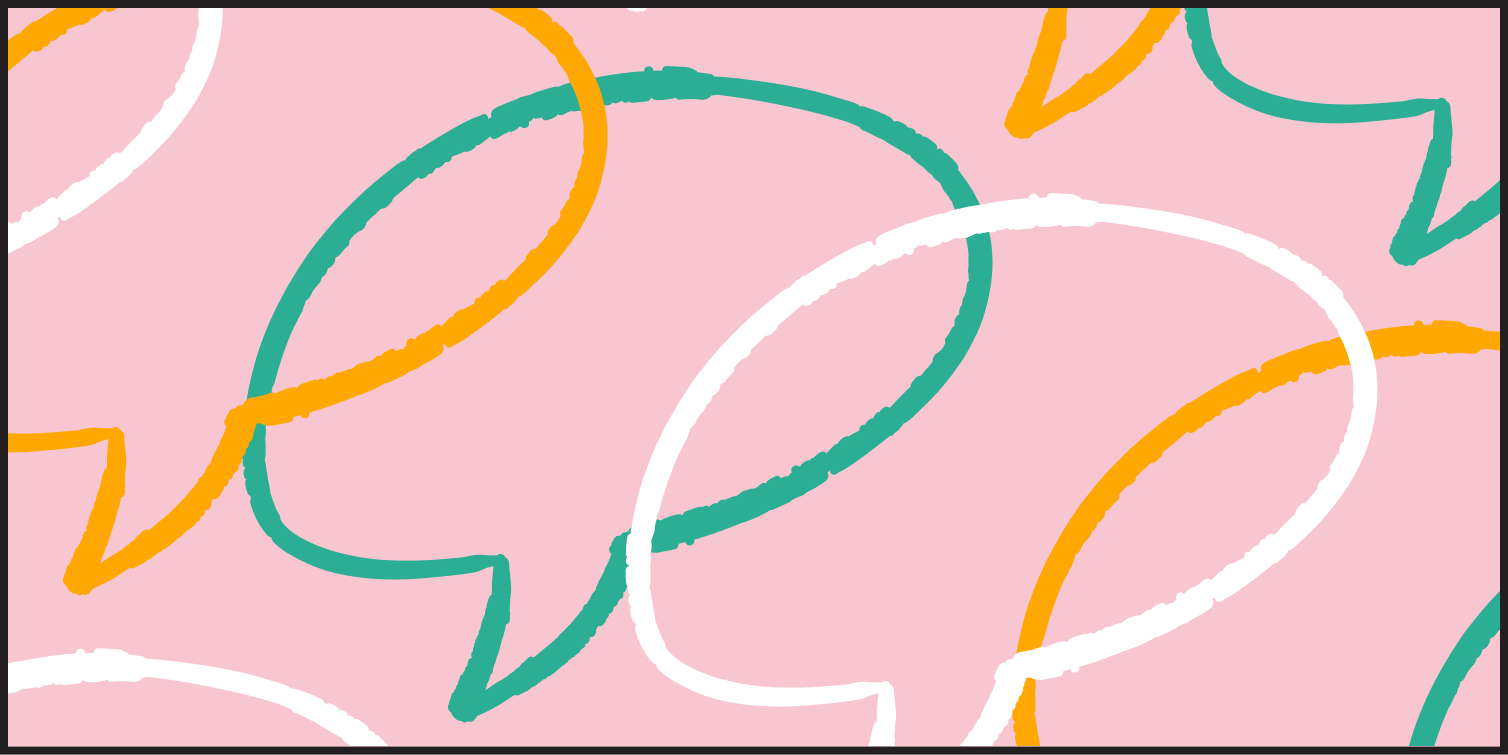
Illustration: overlapping speech bubble pattern (rough lines)
Illustration: green lightning bolts pattern
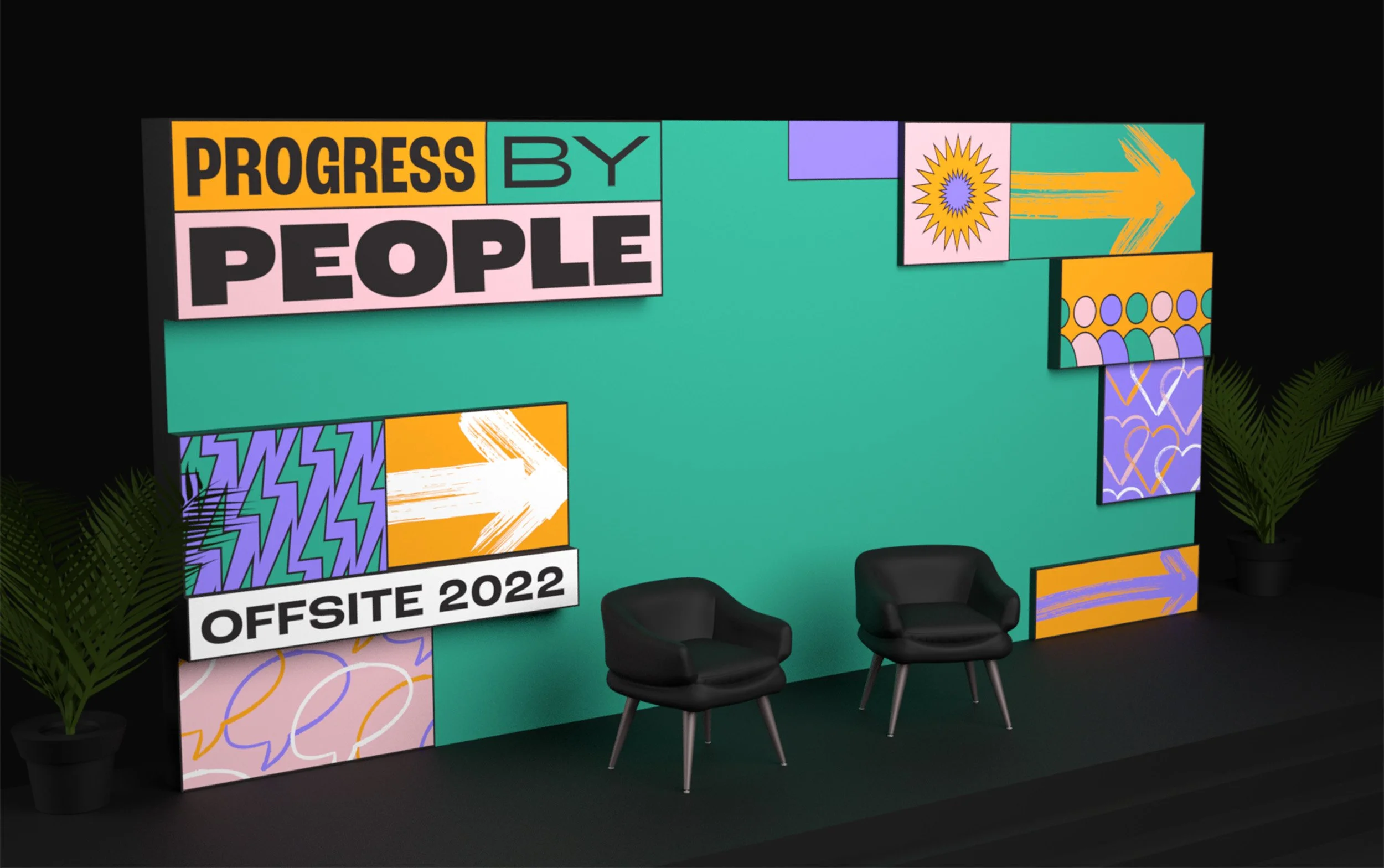
Progress by People stage design with illustrations: sunbursts, arrows, hearts, people, lightning
Illustration: overlapping people outline pattern
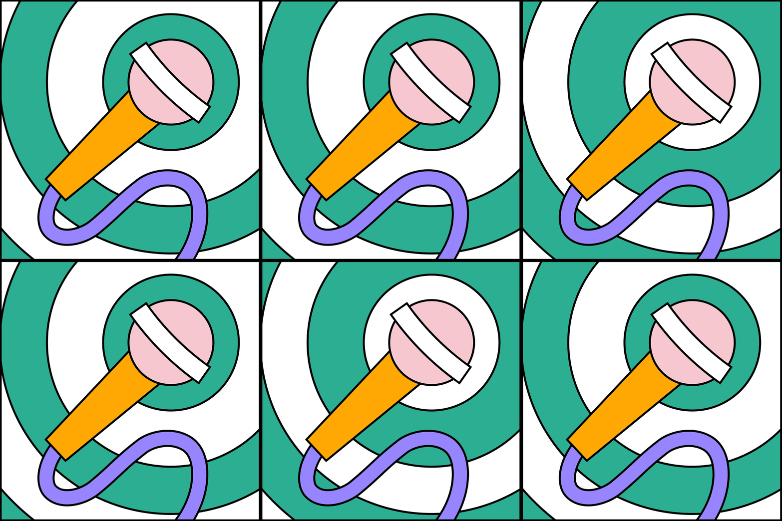
Animation: Microphone with circle design with alternating colors

The Approach

Grafik developed a bright, modular visual language built from flexible design components that could be recombined to create a wide range of expressions across the event experience.

A system of adaptable building blocks, including custom icons, illustration elements, and graphic shapes. We enabled the internal team to generate new layouts and moments while maintaining brand cohesion.

A focused five-color palette anchored the system, ensuring that even as compositions shifted and evolved, the overall identity remained unified and recognizable.

Planning an event or conference?
Let’s build a brand system for it.

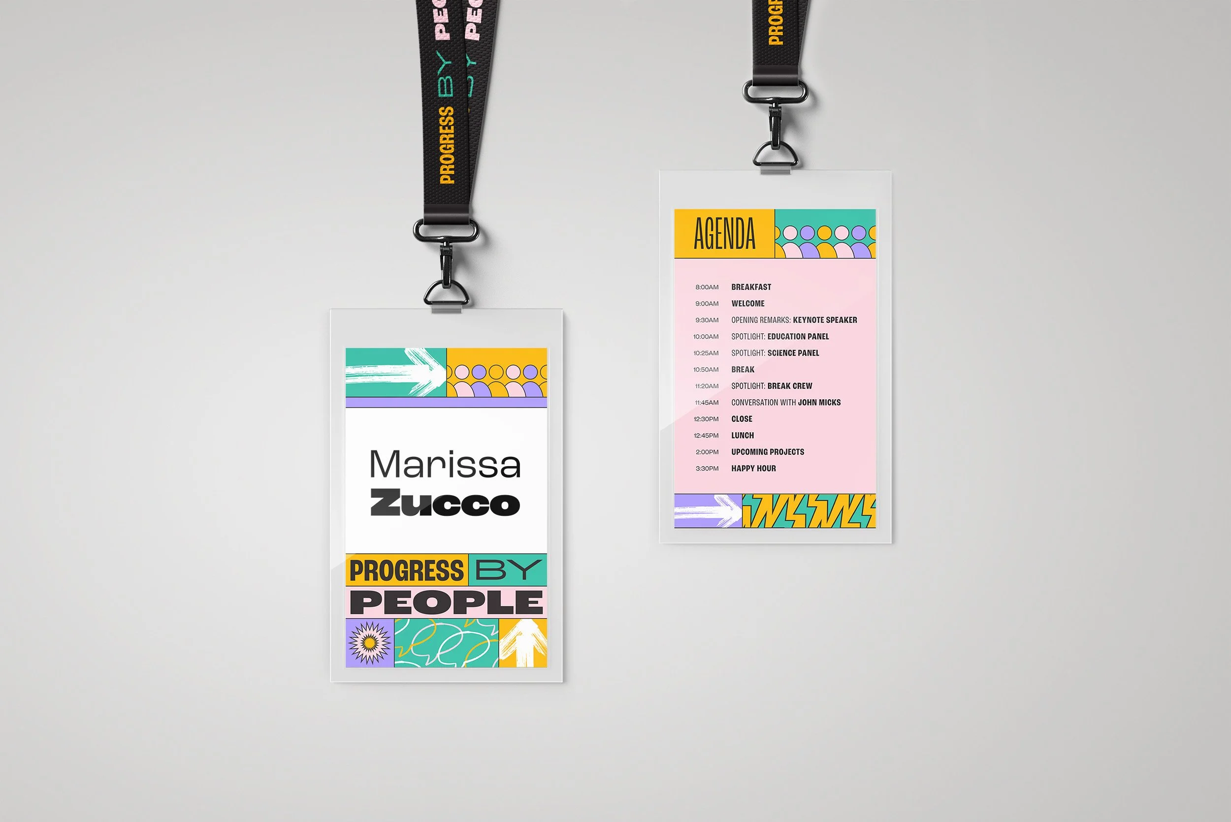
Lanyards: Front design highlighting name, back design with agenda
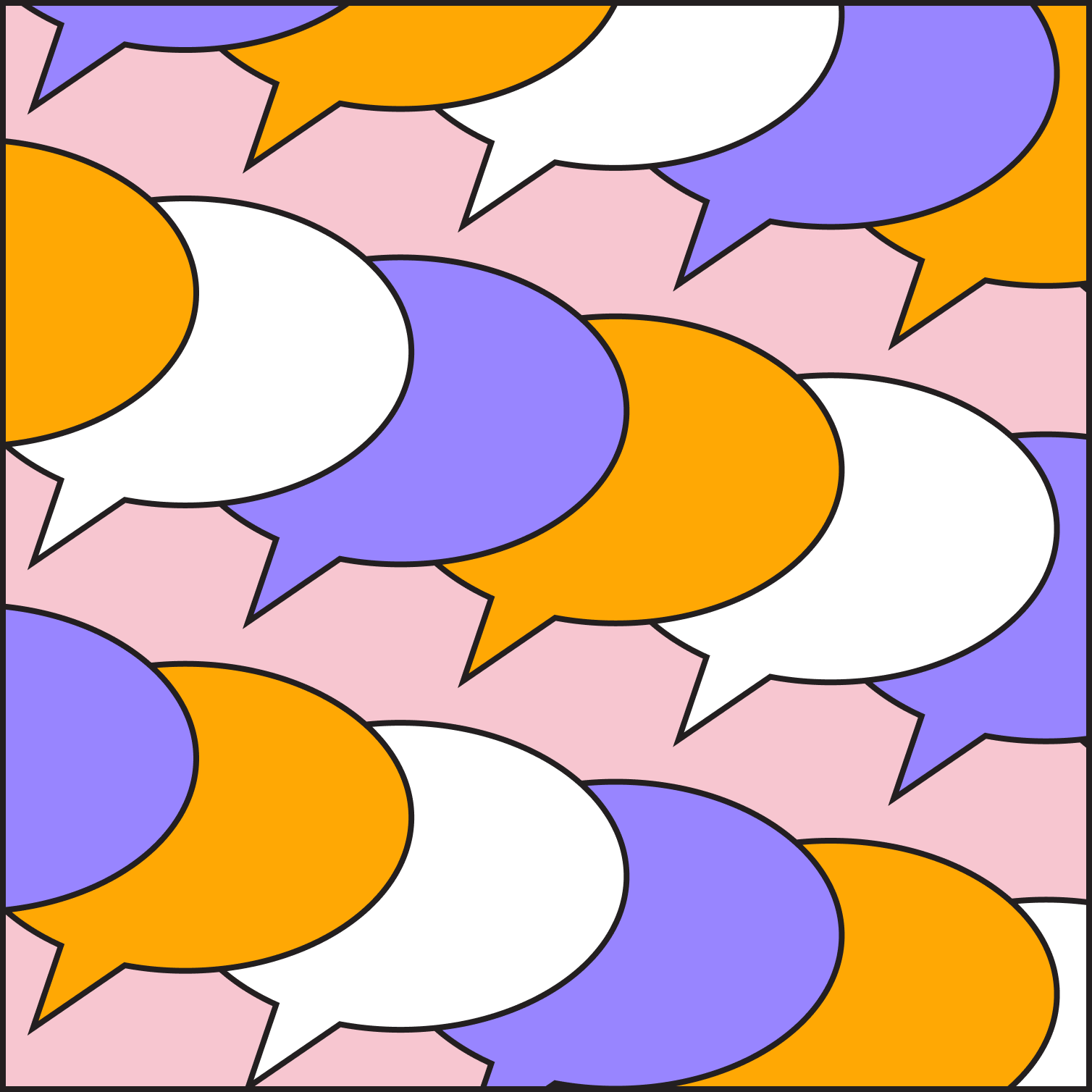
Illustration: overlapping speech bubble pattern (solid lines)
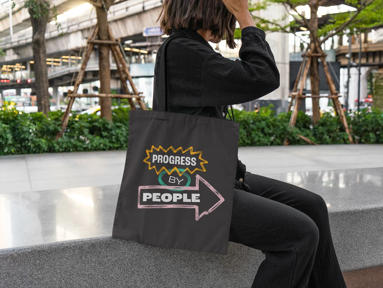
Progress by People tote bag hanging on woman's shoulder
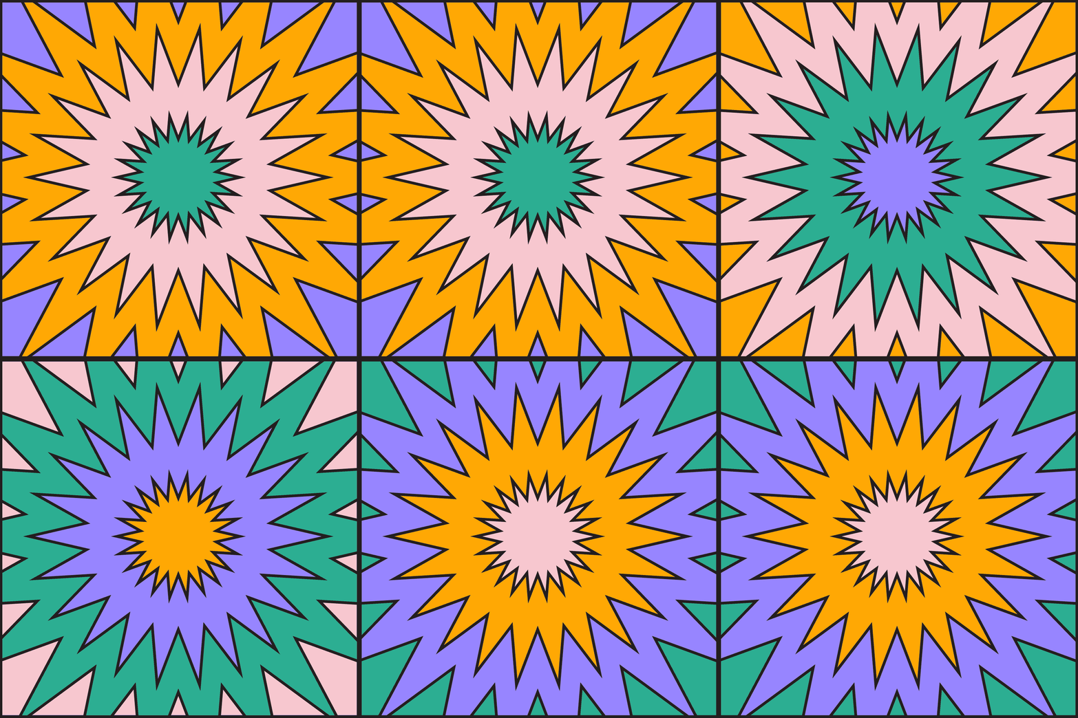
Animation: sunburst with alternating color patterns
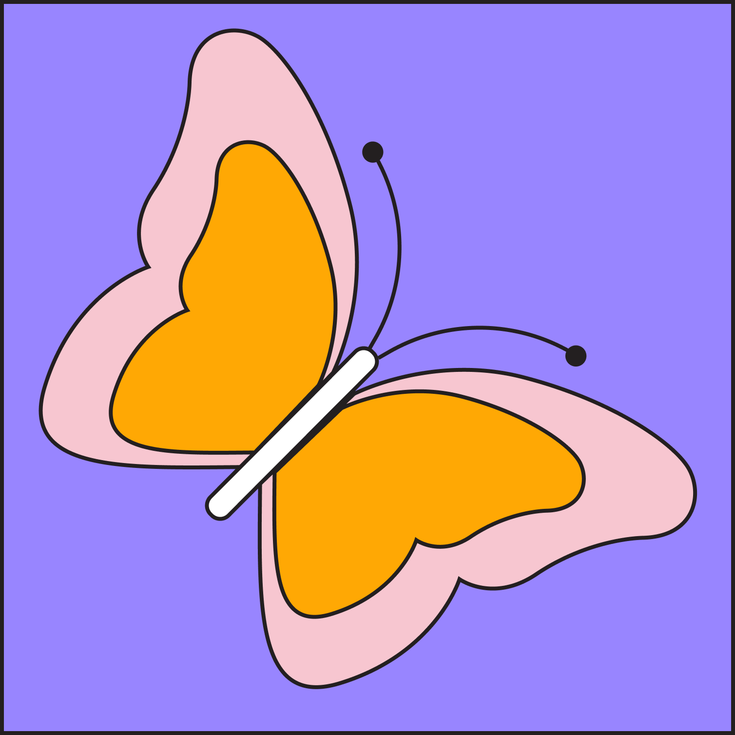
Illustration: butterfly
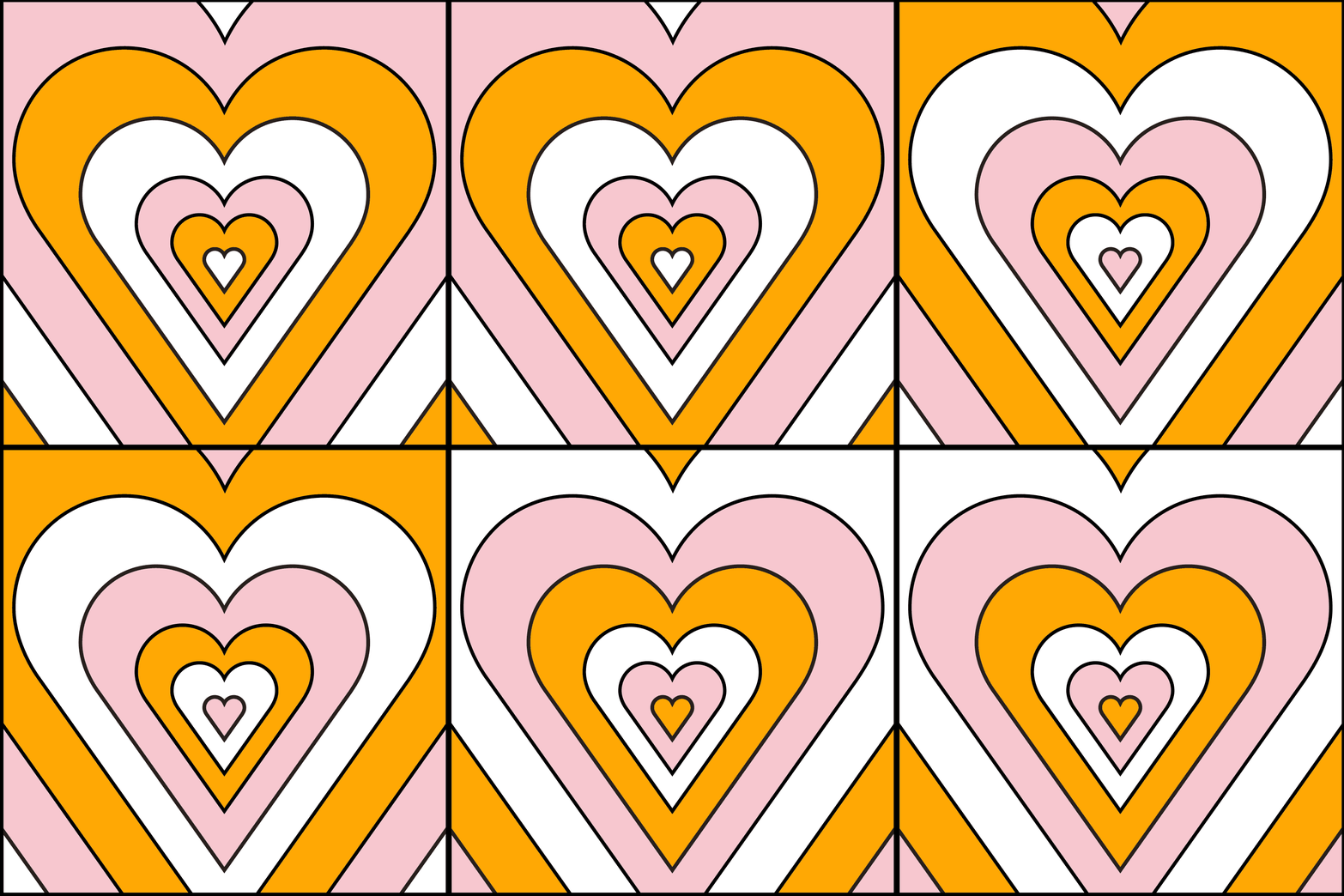
Illustration: Overlapping hearts pattern

OUR SOLUTION

What we designed

Event branding & visual identity

  • Core event identity and art direction

  • Modular graphic system for flexible layouts

  • Five-color palette for cohesion and scalability

  • Custom illustration style and visual language

Presentation & speaker assets

  • Keynote and presentation deck templates

  • Custom lower-third graphics for speakers

  • Motion introductions and transitions

  • Animated countdown timer for stage sessions

Motion & animation

  • Animated system elements for presentations

  • Speaker intro animations

  • Countdown and interstitial graphics

  • Flexible motion toolkit for ongoing use

Environmental & attendee materials

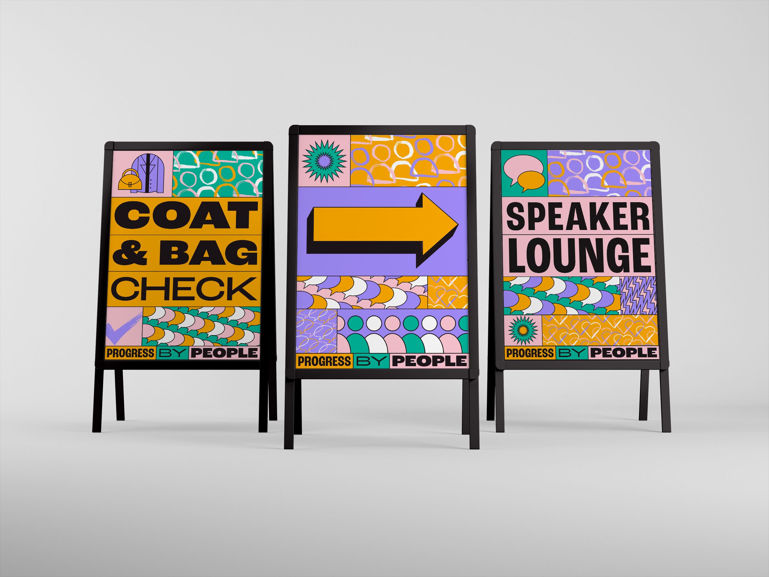
  • Wayfinding and environmental signage

  • Lanyards and badges

  • Swag and printed collateral

  • On-site branded applications

Iconography & illustration

  • Custom icon system

  • Scalable illustration library

  • Graphic elements designed for recombination

  • Flexible toolkit for future event use

Design System Strategy

Flexibility meets cohesion

To support the fast-moving nature of a live event environment, the identity system was designed around modular components that could be easily rearranged and recombined.

This approach allowed the client’s internal teams to generate new assets quickly, from presentation slides to signage, without compromising visual integrity.

The limited color palette reinforced consistency across every touchpoint, while bold compositions and expressive illustration created a vibrant, engaging atmosphere for attendees.

The result was an event identity that felt both structured and dynamic, capable of evolving throughout the experience while remaining unmistakably unified.

The final system delivered a cohesive and scalable visual language that supported:

  • Multi-day programming with high-profile speakers

  • Seamless integration across digital and physical environments

  • Real-time content creation by internal teams

  • A visually unified attendee experience

  • A reusable toolkit for future events and internal communications

By balancing structure with flexibility, the event branding created a strong visual foundation that could expand and adapt as the experience unfolded.

Animation: Heart illustration with alternating colors

Next project