

Real Estate Brand Identity, Website & Launch Campaign for MOD Real Estate
Mod Real Estate CASE STUDY
We partnered with MOD to create a refined, modern brand identity for a residential real estate business built on clarity, confidence, and personal connection.
The engagement included logo design, a full identity system, signage, website reskin, launch campaign assets, and a comprehensive business collateral system. The goal was to position MOD as a contemporary, mid-century modern design-forward real estate brand that stands apart from traditional agent branding while remaining approachable and trustworthy.
This case study outlines not only the final direction but the strategic process and alternate concepts explored along the way.
BRANDING
Visual Identity
SIGNAGE
MOTION
BUSINESS SYSTEM
SOCIAL TEMPLATES


The Challenge
MOD needed a cohesive, elevated brand that could support both immediate launch and long-term growth.
The brand required:
A distinctive logo and identity system
Professional yet modern positioning
Cohesive signage and physical presence
A polished digital experience
Social and marketing templates for ongoing use
Launch materials to introduce the brand
A flexible system that could scale with the business
The identity needed to feel sophisticated and confident without becoming overly corporate or impersonal.
Brand Strategy & Creative Direction
The brand direction centered on clarity, modernity, and confidence. We aimed to create an identity that felt editorial and design-aware, more aligned with contemporary lifestyle brands than traditional real estate visuals.
Key goals:
Clean, confident typography
Elevated minimalism
Strong but approachable presence
Flexibility across signage, print, and digital
A system that supports growth and recognition
Logo Design Process
We developed multiple logo directions exploring different expressions of modern real estate branding, from bold typographic solutions to more minimal, understated marks.
Each option examined:
Scalability across signage and digital
Legibility at various sizes
Distinctiveness within the real estate market
Long-term brand flexibility
Presenting alternate directions allowed us to refine the brand collaboratively and ensure the final selection aligned fully with the client’s vision.
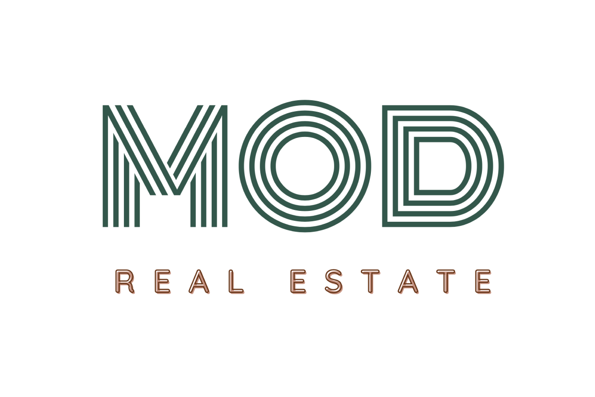
Final Logo Direction
The selected logo balances modern simplicity with strong presence, creating a mark that feels confident and timeless.
The typography-driven approach ensures versatility across:
Yard and property signage
Website and social media
Print collateral
Marketing materials
The result is a logo that feels equally at home on a sign in front of a property or within a refined digital layout.
MCM inspiration


Four distinct concepts
Armed with a wealth of knowledge and an embarrassment of riches in inspiration we ultimately presented four distinct brand concepts to our client—you can ogle all four directions below.
Concept 1
Contour
This concept feels timeless while honoring the distinct mid-mod style through typography and color palette. The graphic shapes and frames you’ll see throughout this brand concept are inspired by residential floor plans, as well as the signature angles of a mid-mod roofline.


Concept 2
Beam
An elevated concept that speaks more to luxury, and higher-value houses. This brand celebrates the contrast between the clean lines of mid-mod architecture and organic, abstract nature. We use the word beam to speak to the literal exposed beam style of mid-mod houses, and the more ethereal beams of light that might shine through a window.


Concept 3
Undulate
This concept takes its cues from the more funky shapes within the mid-mod style, making it the most friendly brand direction. Undulate refers to the movement within the logomark itself and the patterns we created inspired by the shores of Rio de Janeiro (where Gaby once lived) and the distinct shape of some of the more iconic furniture of the era.


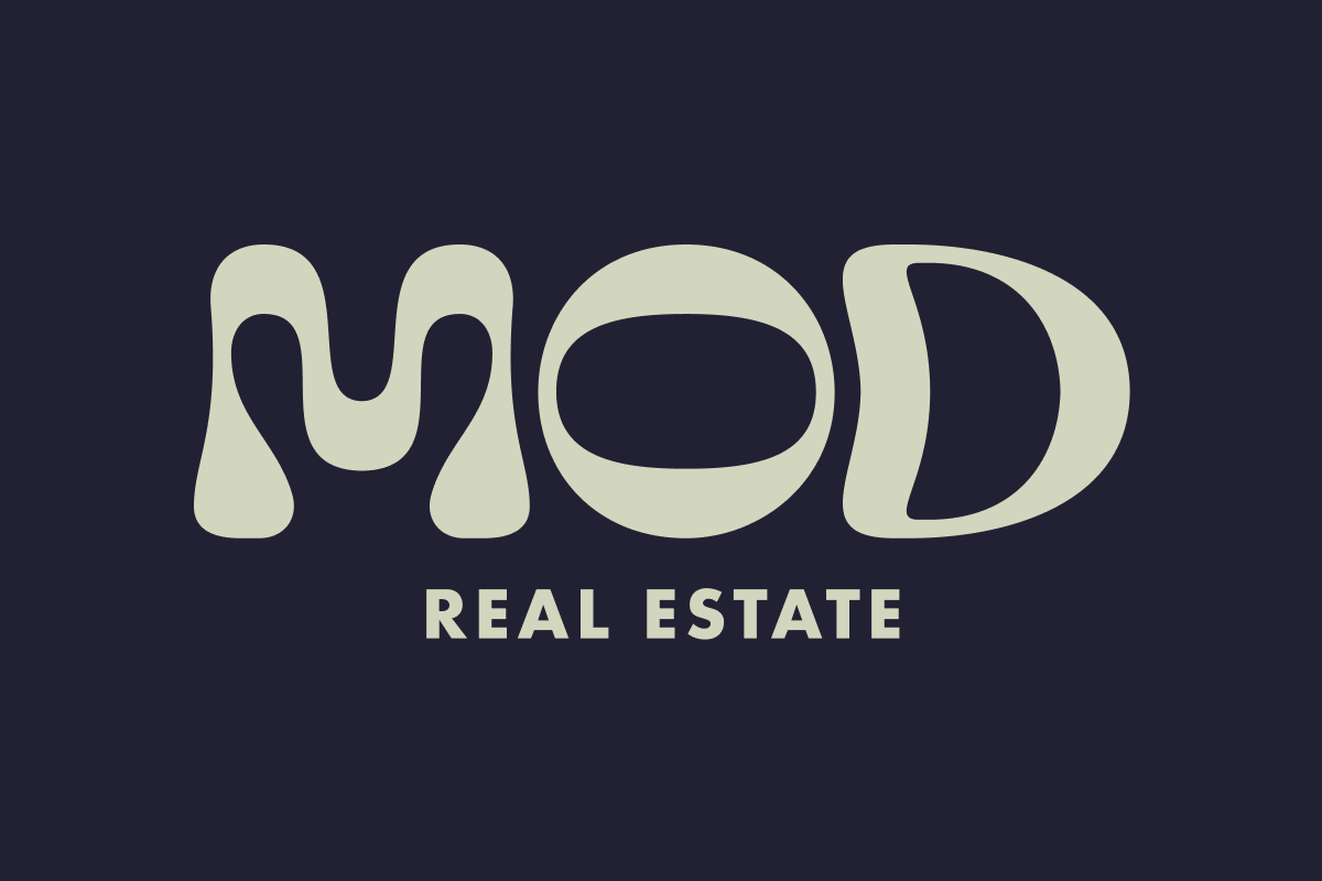
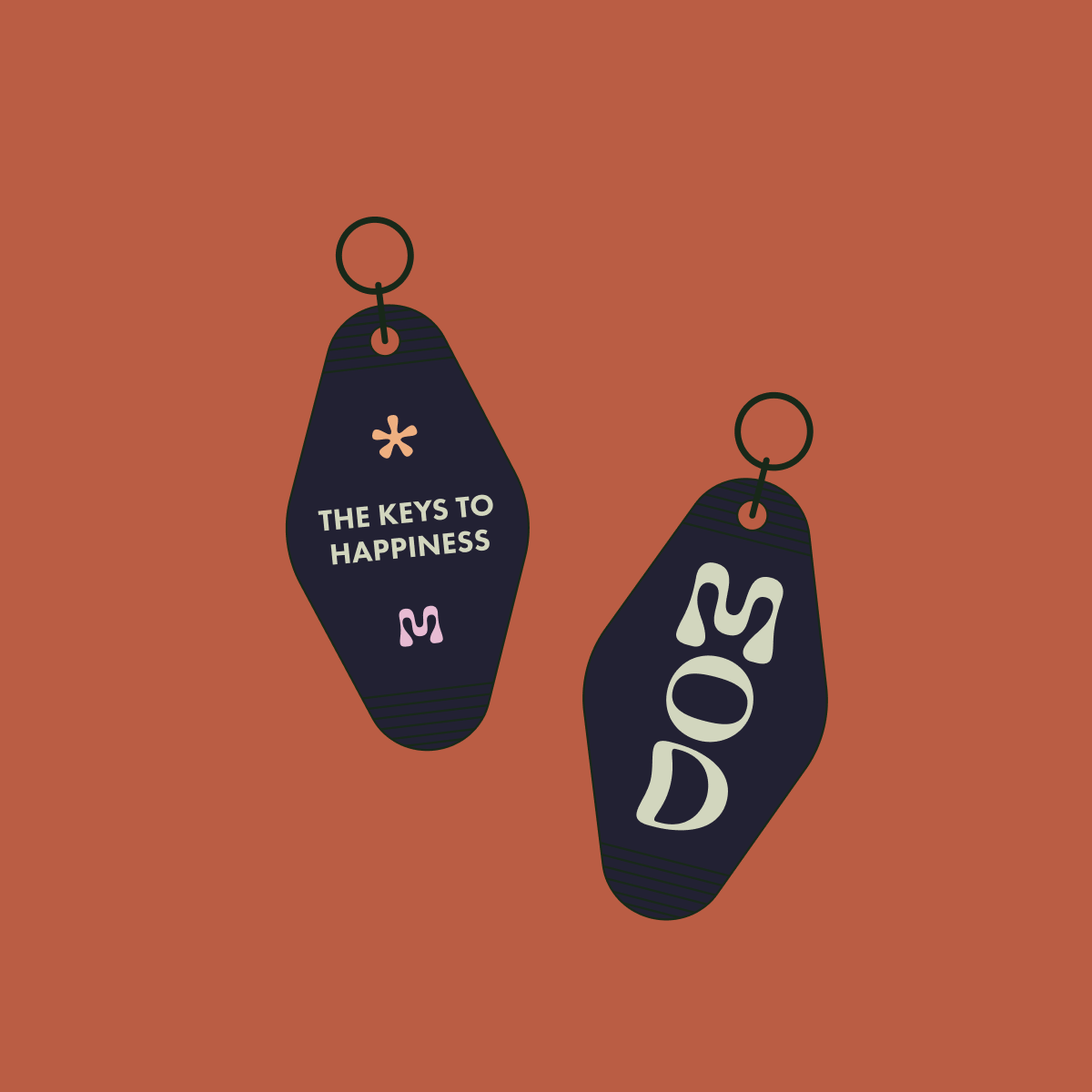
Concept 4
Nest
We centered this concept around the idea of the home as a nest. The graphic style is retro and chic, and the logo design itself is savvy and smart. The O in Mod is nested within the negative space, allowing the center shape to be read both as an O and as an I for mid-mod.


While we hold each concept dear to our hearts, we were extra enthusiastic about the playful direction they ultimately chose.


Brand Identity System
We developed a complete visual identity system to support MOD across all touchpoints.
Identity Elements
Primary and secondary logo variations
Typography system
Color palette
Layout guidelines
Graphic treatments and spacing rules
The system ensures consistency while allowing flexibility for different marketing needs.
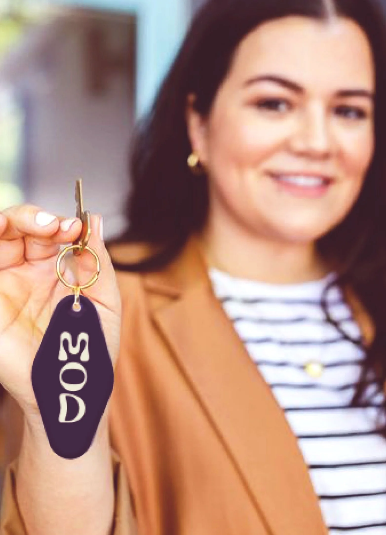
Signage & Environmental Applications
Real estate signage is often the most visible expression of a brand, so clarity and recognizability were critical.
We designed signage that:
Maximizes readability from a distance
Feels modern and premium
Maintains strong brand presence
Works across property types and locations
The signage reinforces the brand’s confident, contemporary tone in real-world environments.


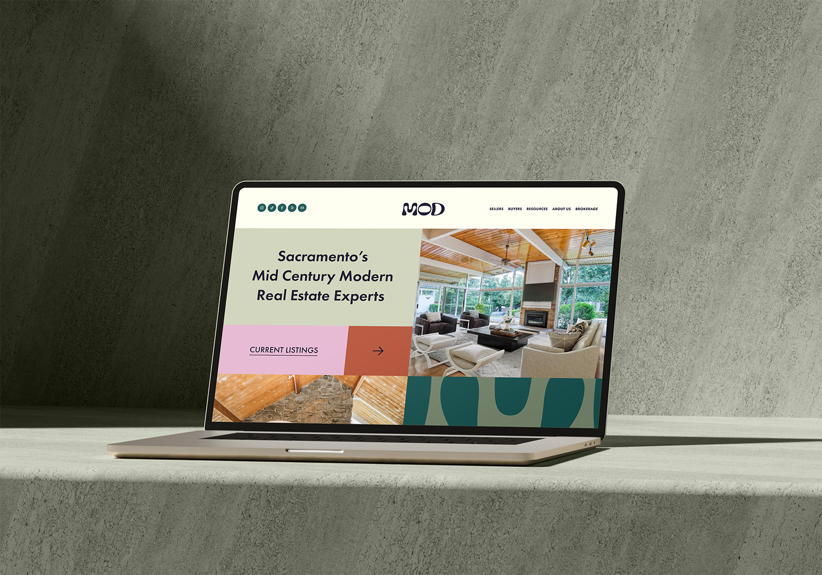
Website Reskin & Digital Presence
We redesigned and reskinned the MOD website to align with the new brand identity.
The updated digital experience emphasizes:
Clean layout and navigation
Strong typography and hierarchy
Consistent brand visuals
A professional yet welcoming tone
The site positions the brand as polished and design-forward while remaining highly functional for potential clients.
Business & Stationery System
A full business collateral system was created to support daily operations and client interactions. This includes:
Business cards
Letterhead and stationery
Branded documents
Client-facing materials
Together, these elements reinforce professionalism and create a cohesive brand experience at every interaction.
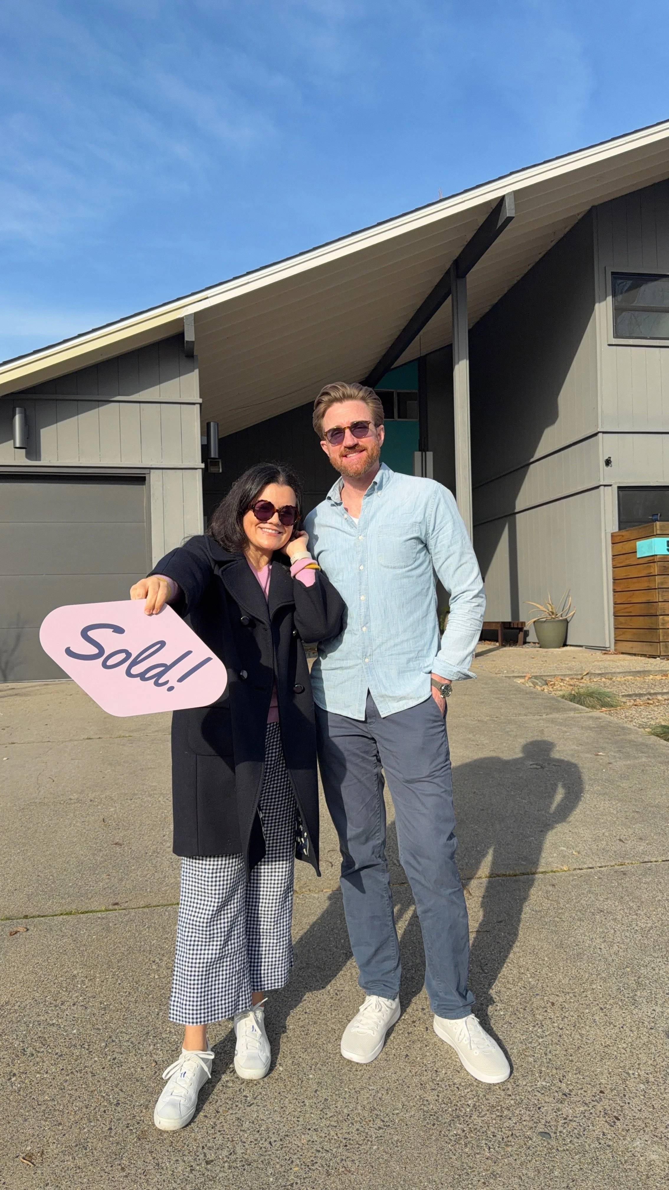
Launch Video & Campaign Assets
To introduce the new brand, we created a launch video and supporting digital assets designed for social and web use.
These materials help establish brand presence and communicate professionalism from the outset, ensuring a cohesive introduction across platforms.
Social Templates & Ongoing Marketing
We developed flexible social media templates that allow for consistent, on-brand communication across listings, announcements, and updates.
These templates provide:
Visual consistency
Ease of use for ongoing marketing
Strong brand recognition
Scalable content creation


Brand launch video for social
Turn your volume up for the full 1960’s, bossa nova, mid-mod experience.
Outcome
MOD launched with a complete and cohesive brand system designed to support both immediate visibility and long-term growth.
The work provides:
A distinctive, modern real estate identity
Cohesive signage and physical presence
A polished digital experience
Launch-ready marketing assets
Scalable templates for ongoing use
Consistency across every client touchpoint
By combining strategic clarity with refined visual design, the brand positions MOD as a confident, contemporary presence in a competitive real estate market.


I had a fantastic experience working with Grafik. Their creativity brought my vision to life, and the attention to detail in their designs truly set them apart. The team was professional, responsive, and delivered high-quality results within my timeline. The collaborative process made me feel involved and valued as a client. The final deliverables not only met but surpassed my expectations, making my investment with them incredibly worthwhile. If you're looking for a reliable and creative graphic design partner, Grafik is the way to go!
“
Gaby Moreira
Co-Founder and Realtor, Mod Real Estate
Launching or Rebranding a Real Estate Business?
We create brand systems for real estate professionals and boutique brokerages, from identity and signage to websites and launch campaigns.
If you’re building or evolving a real estate brand:

